IOS开发
- Lecture 1
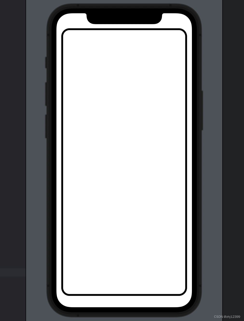
- Text
- RoundedRectangle
- Zstack
- Lecture 2
- HStack
- struct整合组件
- ContentView
- struct 中创建变量
- var&let
- SwiftUI刷新重建
- 点击效果
- Array
- Foreach
- Button
- Spacer
- var整合小组件
- SF-symbol
- 上下界限制
- 简化Button
- 调整布局颜色
- LazyVGrid
- ScrollView
- strokeBorder
- 横向设计
- Lecture 2 Assignment I
- Required Tasks
- Screenshot
- Hints
- Things to Learn
- My Code
- Extra Credit
- My Extra Credit Code
- Lecture 1-2 课程资源
Lecture 1
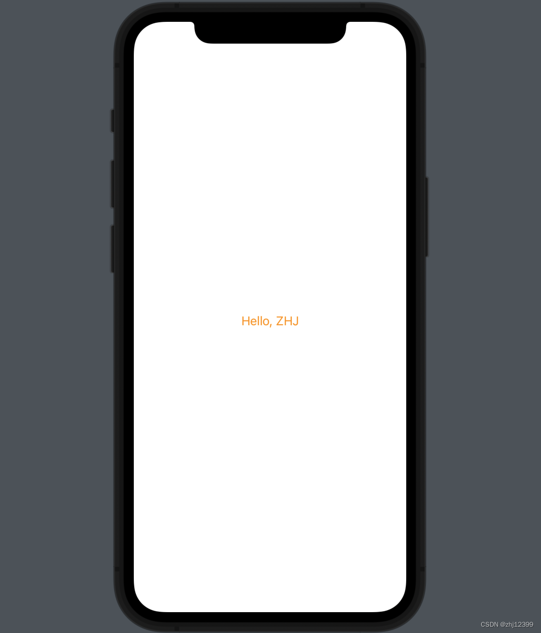
Text
swift">import SwiftUI

struct ContentView: View {
    var body: some View {
        Text("Hello, ZHJ").foregroundColor(Color.orange).padding()
        //return Text()
        //Text(string: "xxx")
        //全写:foregroundColor(color: Color.orange)或者甚至直接简写成
        //foregroundColor(.orange)
        //padding()边框大小
    }
}
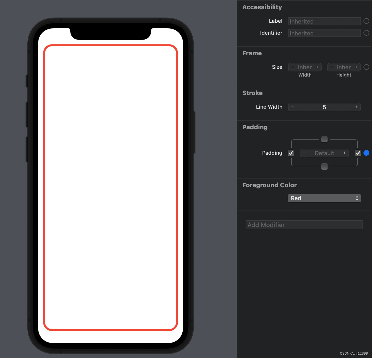
RoundedRectangle
swift">import SwiftUI

struct ContentView: View {
    var body: some View {
        RoundedRectangle(cornerRadius: 25.0)//圆角度数
    }
}
swift">import SwiftUI

struct ContentView: View {
    var body: some View {
        RoundedRectangle(cornerRadius: 20).stroke(lineWidth: 5).padding(.horizontal)
    }
}
swift">import SwiftUI

struct ContentView: View {
    var body: some View {
        RoundedRectangle(cornerRadius: 20)
            .stroke(lineWidth: 5)
            .padding(.horizontal)
            .foregroundColor(.red)
    }
}
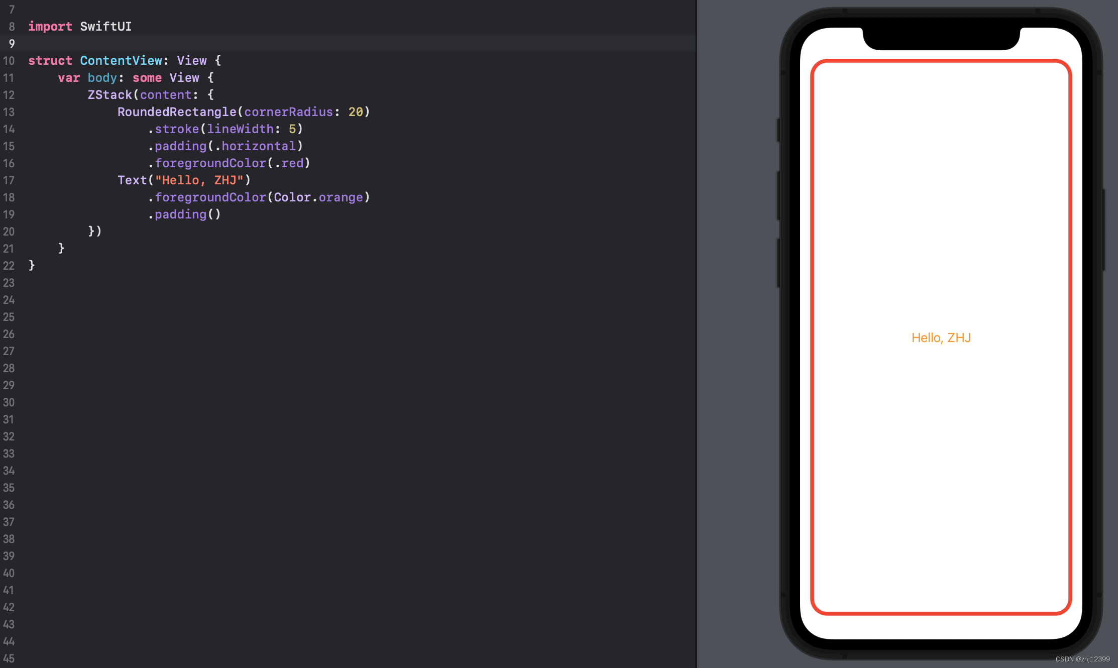
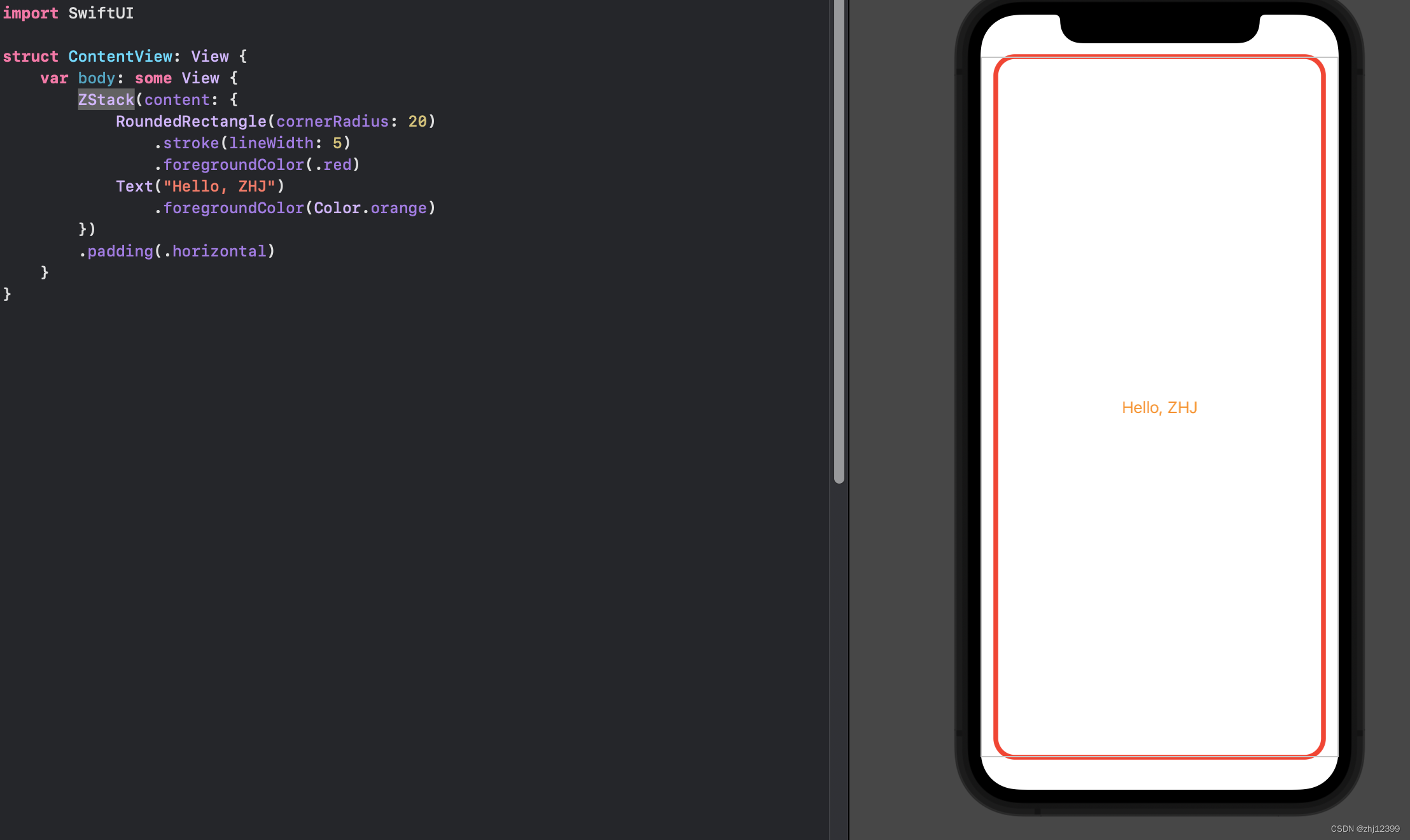
Zstack
swift">import SwiftUI

struct ContentView: View {
    var body: some View {
        ZStack(content: {
            RoundedRectangle(cornerRadius: 20)
                .stroke(lineWidth: 5)
                .padding(.horizontal)
                .foregroundColor(.red)
            Text("Hello, ZHJ")
                .foregroundColor(Color.orange)
                .padding()
        })
    }
}
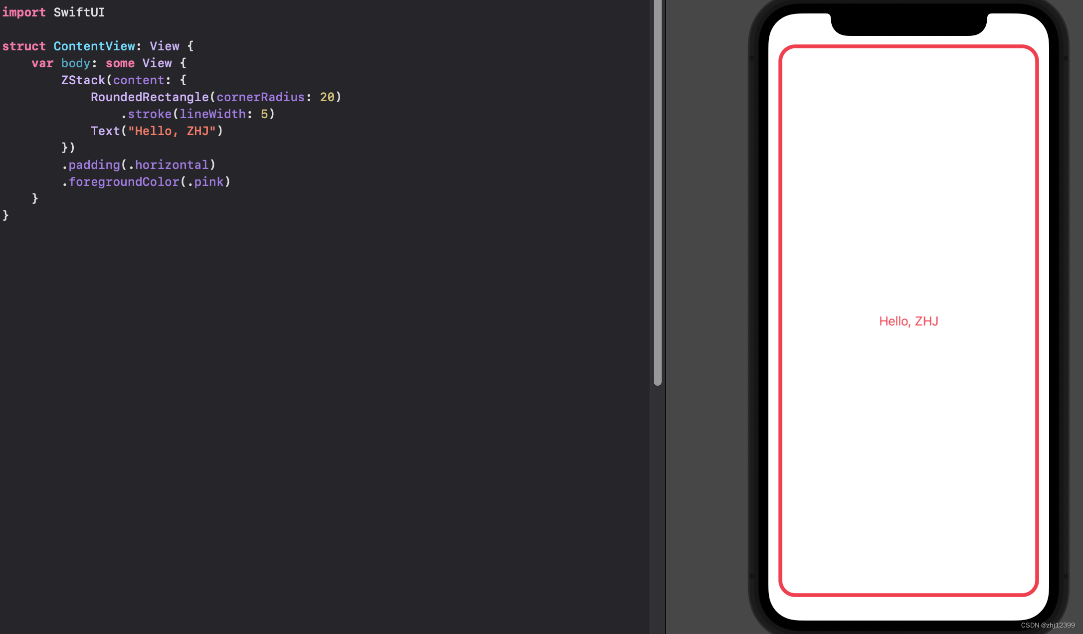
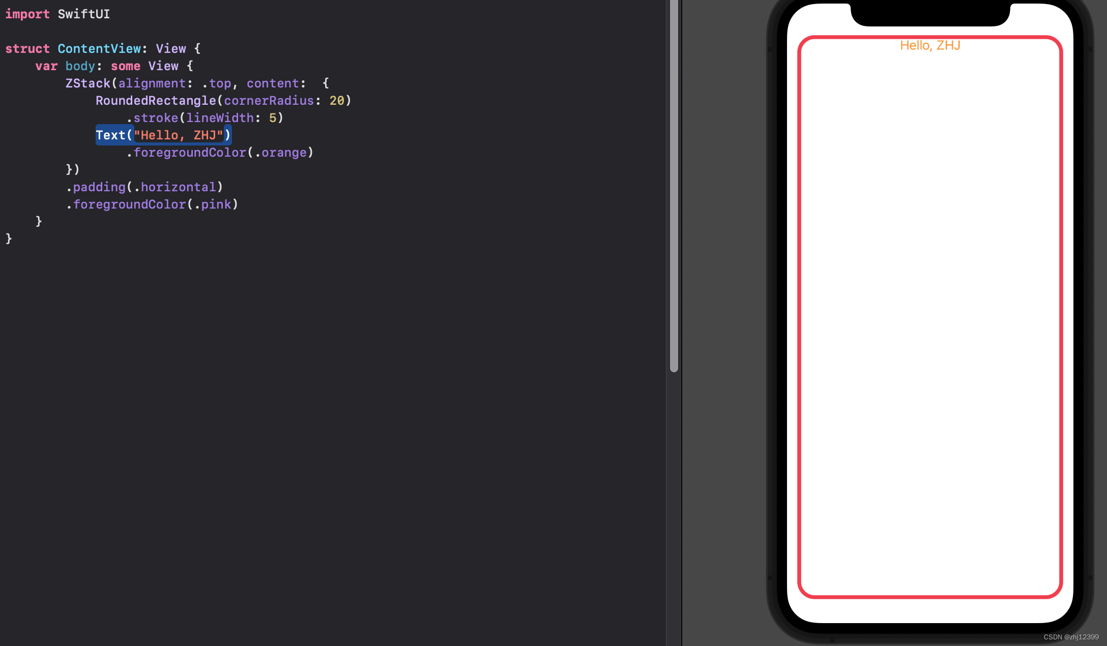
swift">import SwiftUI

struct ContentView: View {
    var body: some View {
        ZStack(alignment: .top, content:  {
            RoundedRectangle(cornerRadius: 20)
                .stroke(lineWidth: 5)
            Text("Hello, ZHJ")
                .foregroundColor(.orange)
        })
        .padding(.horizontal)
        .foregroundColor(.pink)
    }
}
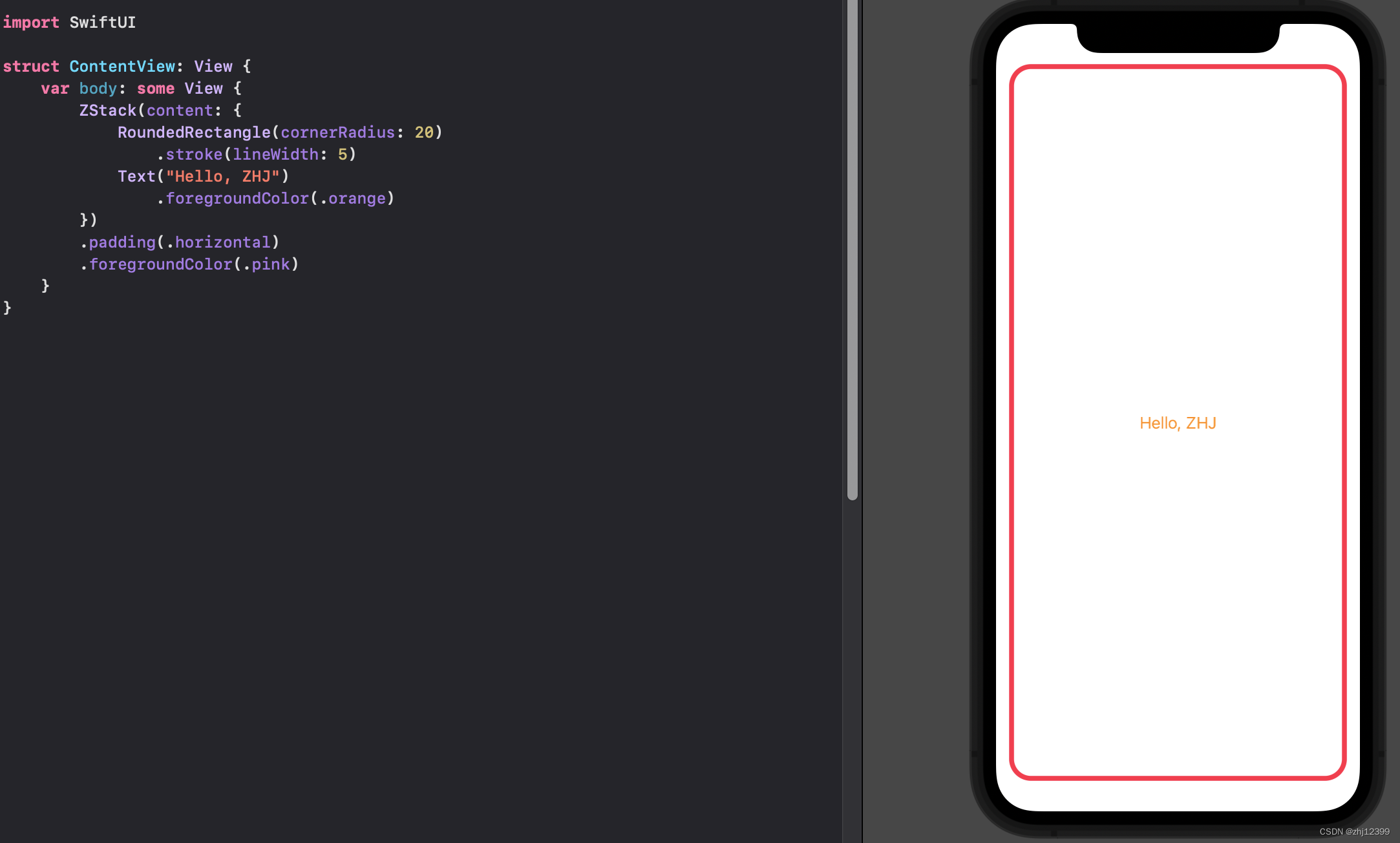
swift">import SwiftUI

struct ContentView: View {
    var body: some View {
    	//将整个{}中的东西不作为最后一个参数,而是直接提炼出来
        ZStack(alignment: .center) {
            RoundedRectangle(cornerRadius: 20)
                .stroke(lineWidth: 5)
            Text("Hello, ZHJ")
        }
        .padding(.horizontal)
        .foregroundColor(.pink)
    }
}
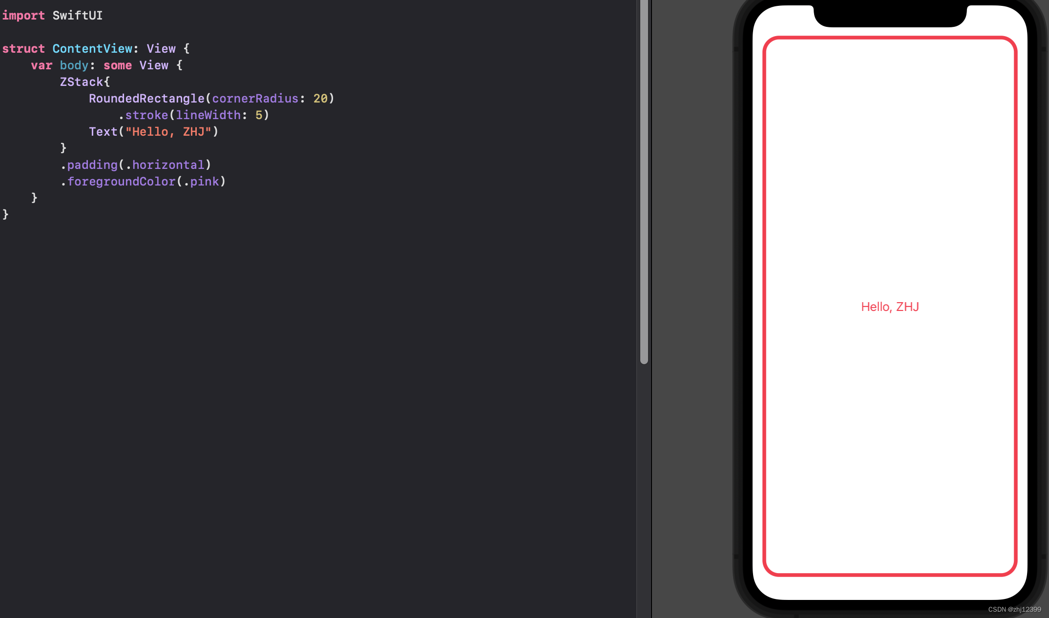
swift">import SwiftUI

struct ContentView: View {
    var body: some View {
    	//如果采用默认居中的话,可以省略()
        ZStack{
            RoundedRectangle(cornerRadius: 20)
                .stroke(lineWidth: 5)
            Text("Hello, ZHJ")
        }
        .padding(.horizontal)
        .foregroundColor(.pink)
    }
}
Lecture 2
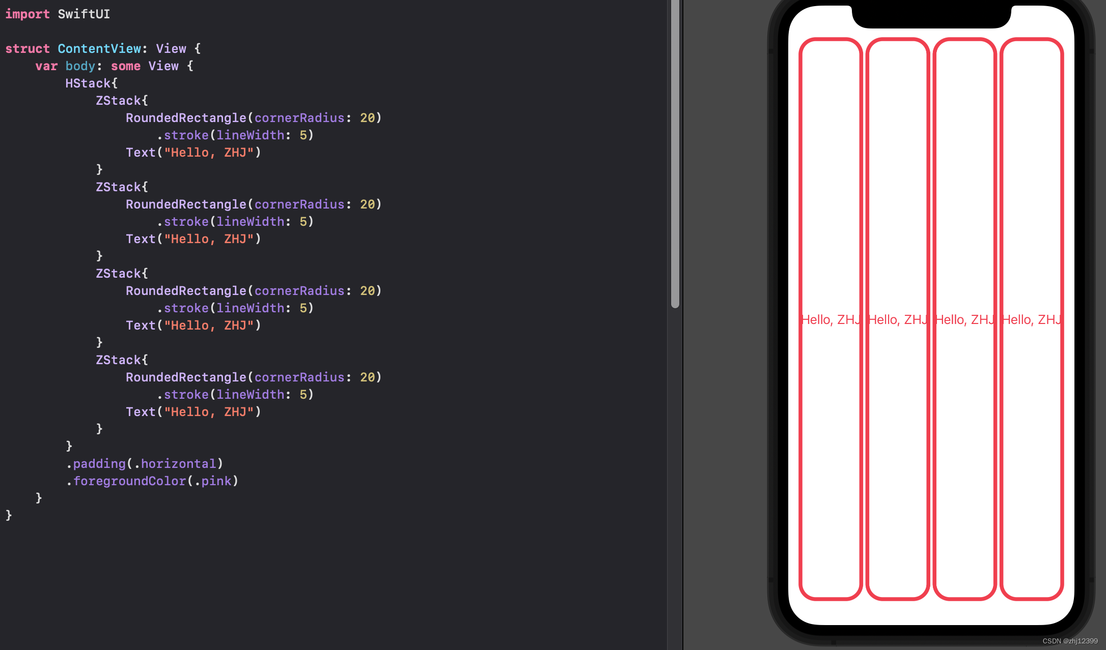
HStack
横向排开的列
swift">import SwiftUI

struct ContentView: View {
    var body: some View {
        HStack{
            ZStack{
                RoundedRectangle(cornerRadius: 20)
                    .stroke(lineWidth: 5)
                Text("Hello, ZHJ")
            }
            ZStack{
                RoundedRectangle(cornerRadius: 20)
                    .stroke(lineWidth: 5)
                Text("Hello, ZHJ")
            }
            ZStack{
                RoundedRectangle(cornerRadius: 20)
                    .stroke(lineWidth: 5)
                Text("Hello, ZHJ")
            }
            ZStack{
                RoundedRectangle(cornerRadius: 20)
                    .stroke(lineWidth: 5)
                Text("Hello, ZHJ")
            }
        }
        .padding(.horizontal)
        .foregroundColor(.pink)
    }
}
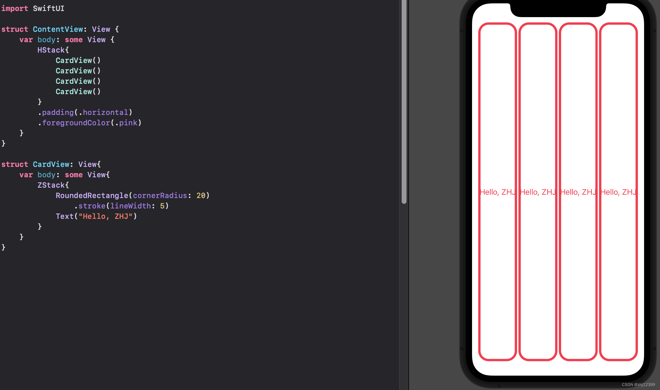
struct整合组件
进一步抽象出类
swift">import SwiftUI

struct ContentView: View {
    var body: some View {
        HStack{
            CardView()
            CardView()
            CardView()
            CardView()
        }
        .padding(.horizontal)
        .foregroundColor(.pink)
    }
}

struct CardView: View{
    var body: some View{
        ZStack{
            RoundedRectangle(cornerRadius: 20)
                .stroke(lineWidth: 5)
            Text("Hello, ZHJ")
        }
    }
}
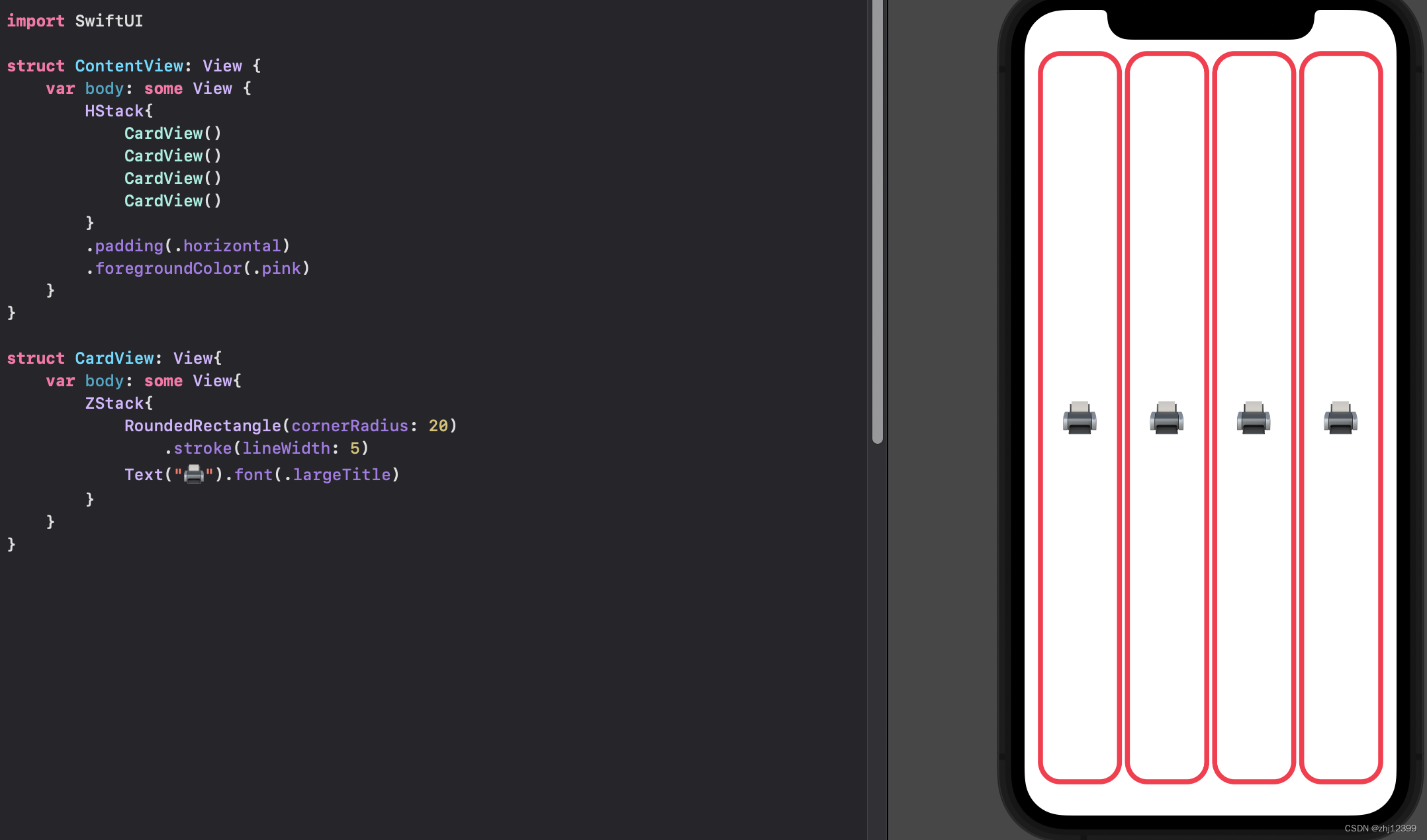
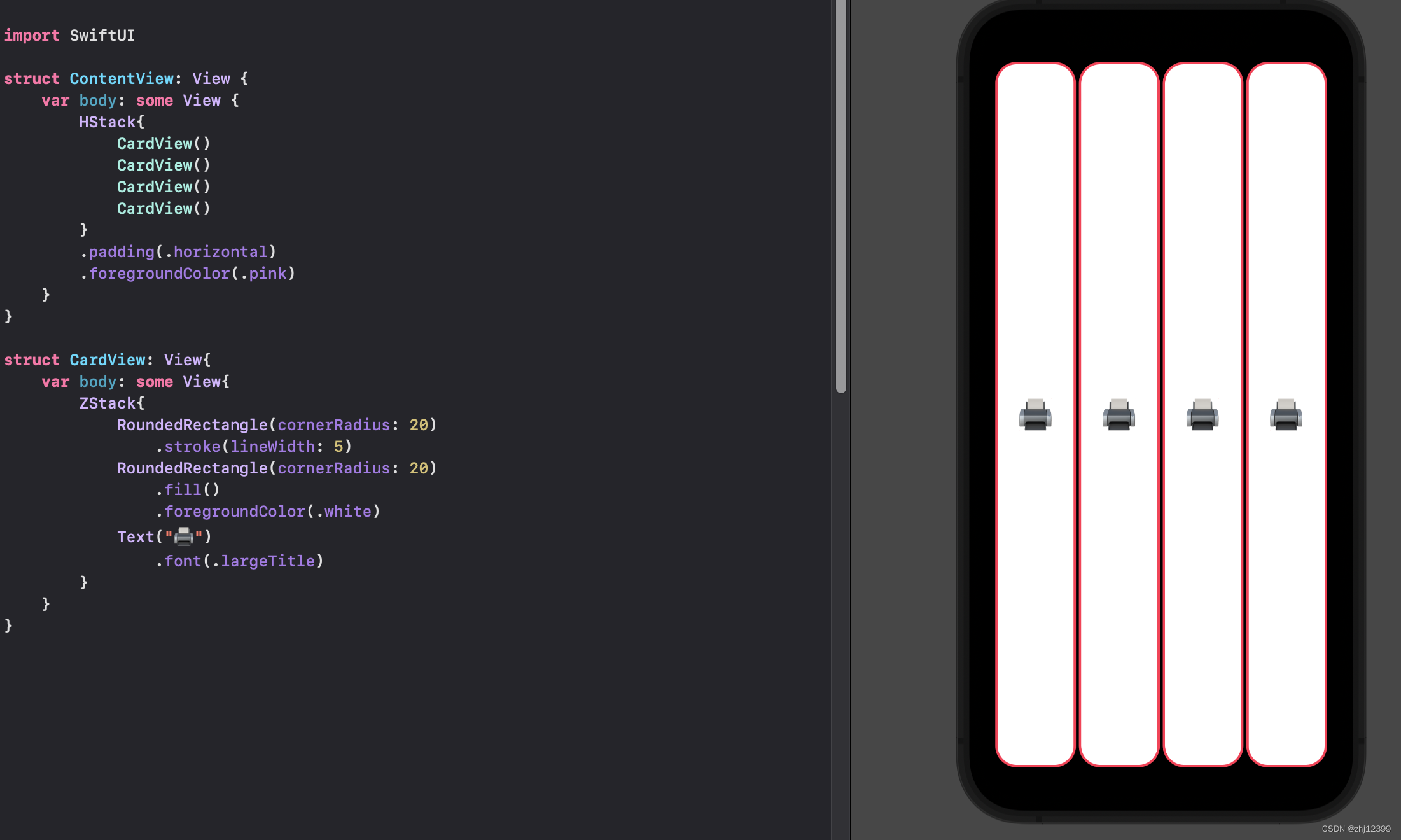
swift">import SwiftUI
struct ContentView: View {
var body: some View {
HStack{
CardView()
CardView()
CardView()
CardView()
}
.padding(.horizontal)
.foregroundColor(.pink)
}
}
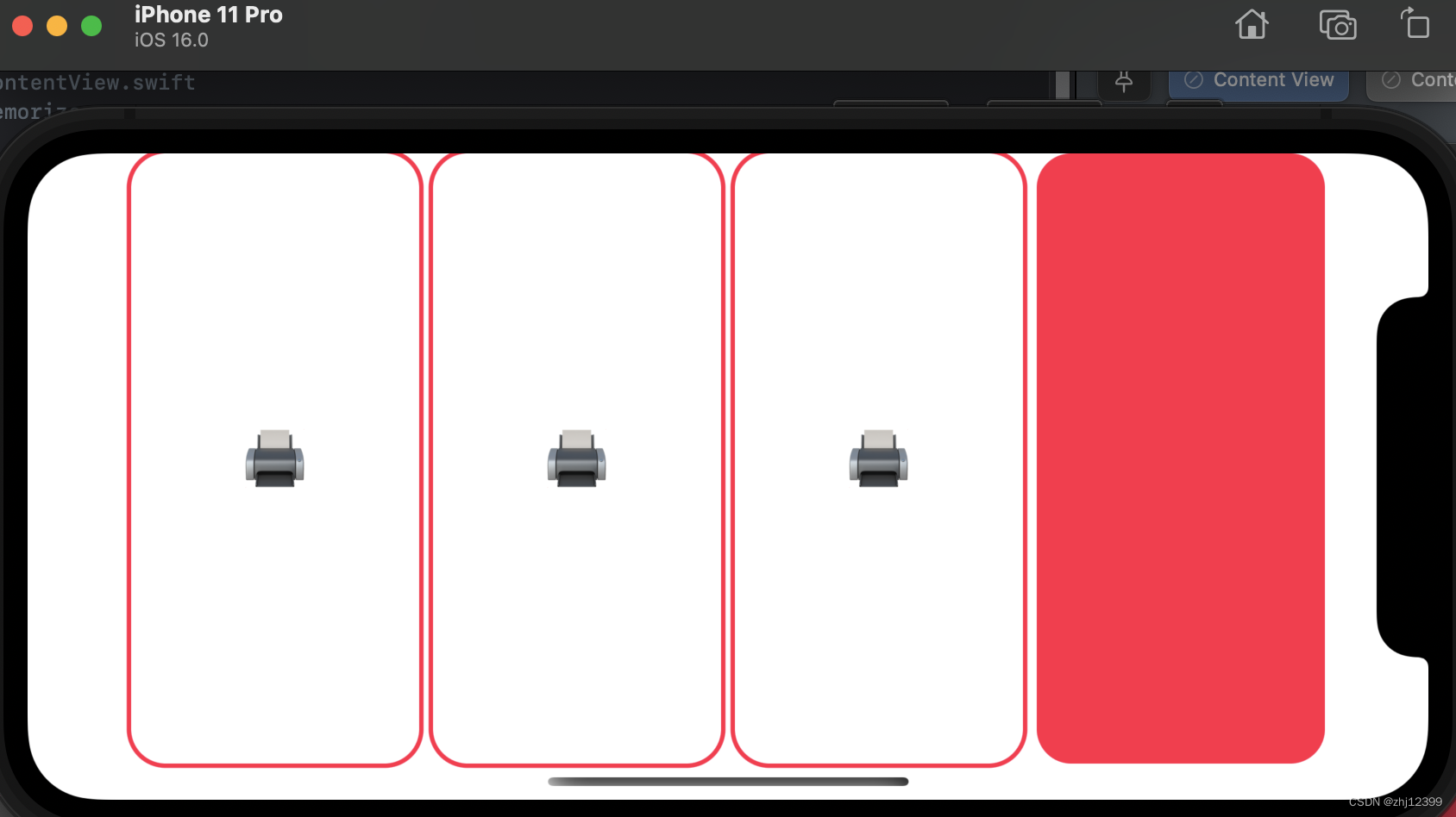
struct CardView: View{
var body: some View{
ZStack{
RoundedRectangle(cornerRadius: 20)
.stroke(lineWidth: 5)
Text("🖨️").font(.largeTitle)
}
}
}
ContentView
放置两个预览器
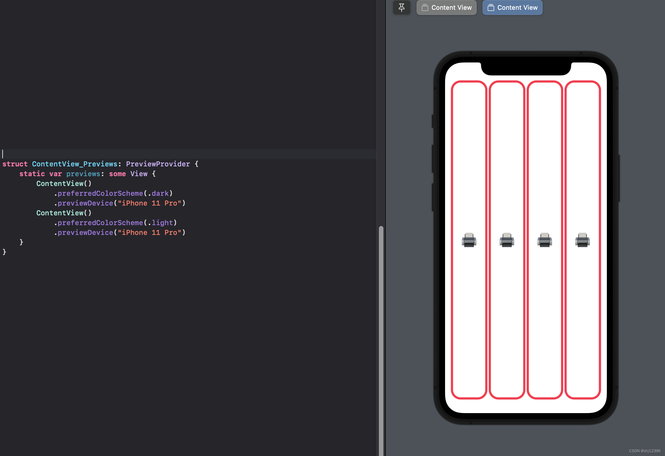
Zstack是纵向堆叠
一个用于堆叠边框
一个用于堆叠背景色
swift">struct CardView: View{
    var body: some View{
        ZStack{
            RoundedRectangle(cornerRadius: 20)
                .stroke(lineWidth: 5)
            RoundedRectangle(cornerRadius: 20)
                .fill()
                .foregroundColor(.white)
            Text("🖨️")
                .font(.largeTitle)
        }
    }
}
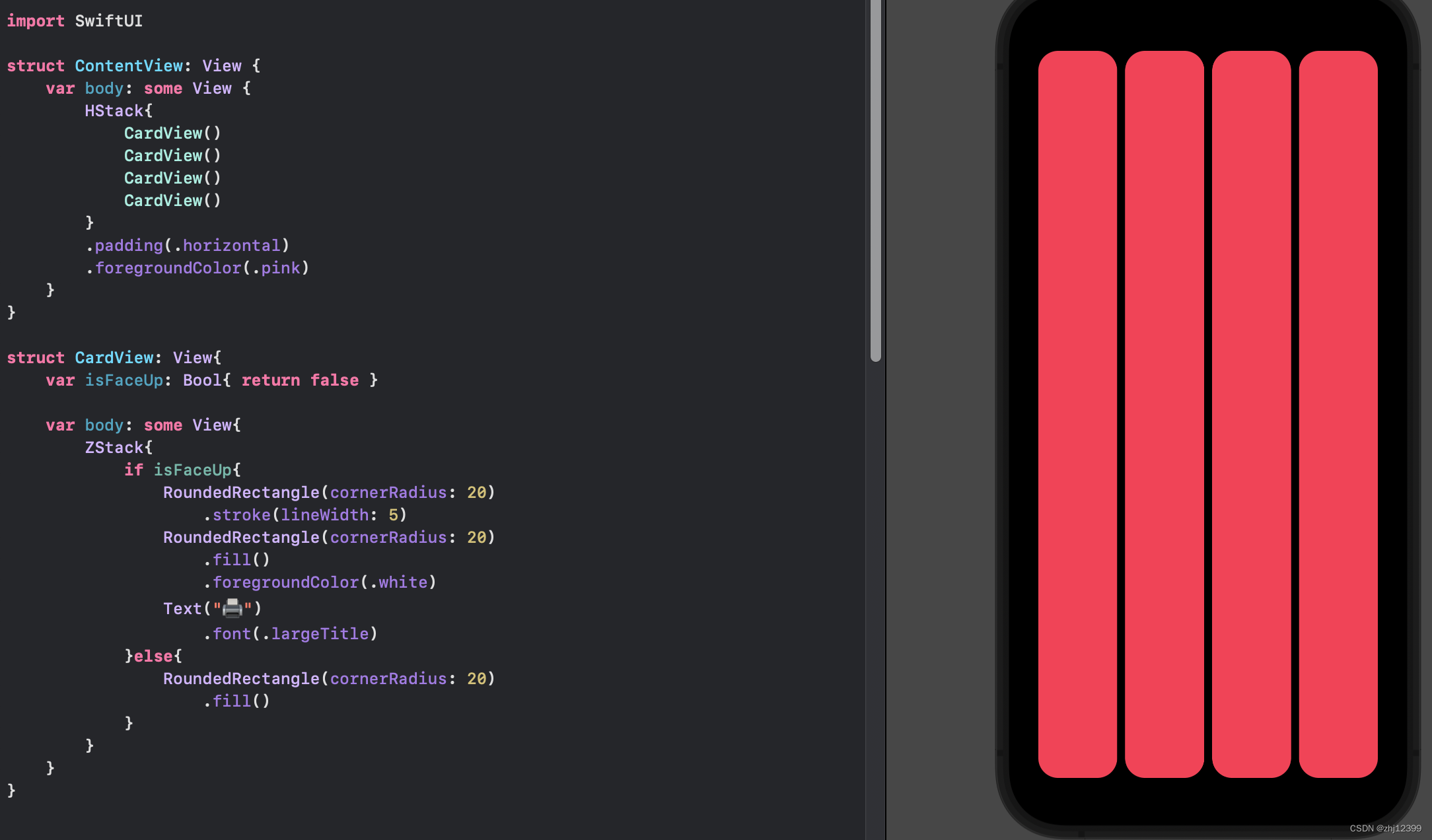
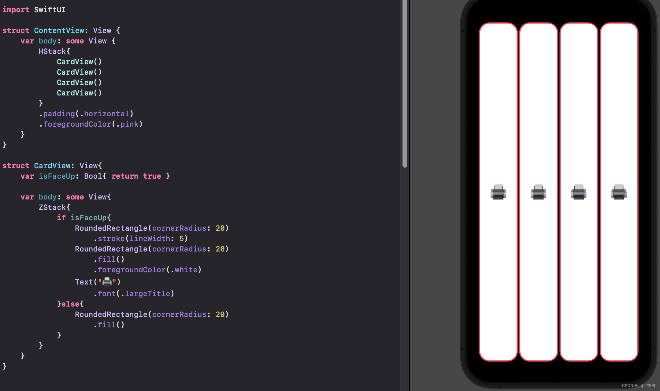
struct 中创建变量
swift">struct CardView: View{
	//变量必须具有有效值,这里使用{}作为一个函数给他一个初始值
    var isFaceUp: Bool{ return false }

    var body: some View{
        ZStack{
            if isFaceUp{
                RoundedRectangle(cornerRadius: 20)
                    .stroke(lineWidth: 5)
                RoundedRectangle(cornerRadius: 20)
                    .fill()
                    .foregroundColor(.white)
                Text("🖨️")
                    .font(.largeTitle)
            }else{
                RoundedRectangle(cornerRadius: 20)
                    .fill()
            }
        }
    }
}
swift">//采用这种变量赋值方法也可以
var isFaceUp: Bool = true
或者在调用View时给一个值
swift">import SwiftUI

struct ContentView: View {
    var body: some View {
        HStack{
            CardView(isFaceUp: true)
            CardView(isFaceUp: false)
            CardView(isFaceUp: true)
            CardView(isFaceUp: false)
        }
        .padding(.horizontal)
        .foregroundColor(.pink)
    }
}

struct CardView: View{
    var isFaceUp: Bool
    //这里也可以把默认值定义上,之后如果有参数传进来就会覆盖默认值
    //var isFaceUp: Bool = true

    var body: some View{
        ZStack{
            if isFaceUp{
                RoundedRectangle(cornerRadius: 20)
                    .stroke(lineWidth: 5)
                RoundedRectangle(cornerRadius: 20)
                    .fill()
                    .foregroundColor(.white)
                Text("🖨️")
                    .font(.largeTitle)
            }else{
                RoundedRectangle(cornerRadius: 20)
                    .fill()
            }
        }
    }
}
每种类型中也能创建局部变量shape
这样可以使进一步简化重复的代码
swift">struct CardView: View{
    var isFaceUp: Bool

    var body: some View{
        ZStack{
            var shape = RoundedRectangle(cornerRadius: 20)
            if isFaceUp{
                shape.stroke(lineWidth: 5)
                shape.fill().foregroundColor(.white)
                Text("🖨️").font(.largeTitle)
            }else{
                shape.fill()
            }
        }
    }
}
var&let
var变量
let常量
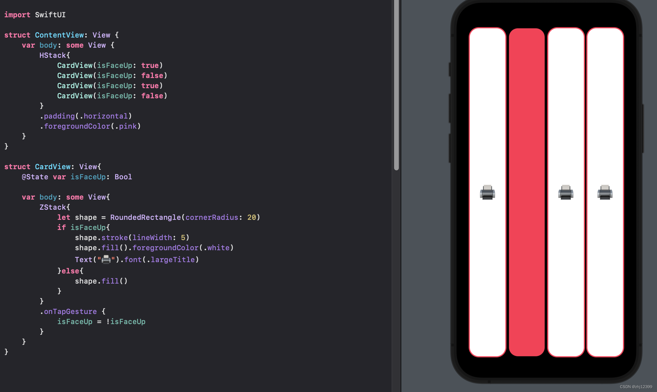
SwiftUI刷新重建
UI在创建后便不能够在改变
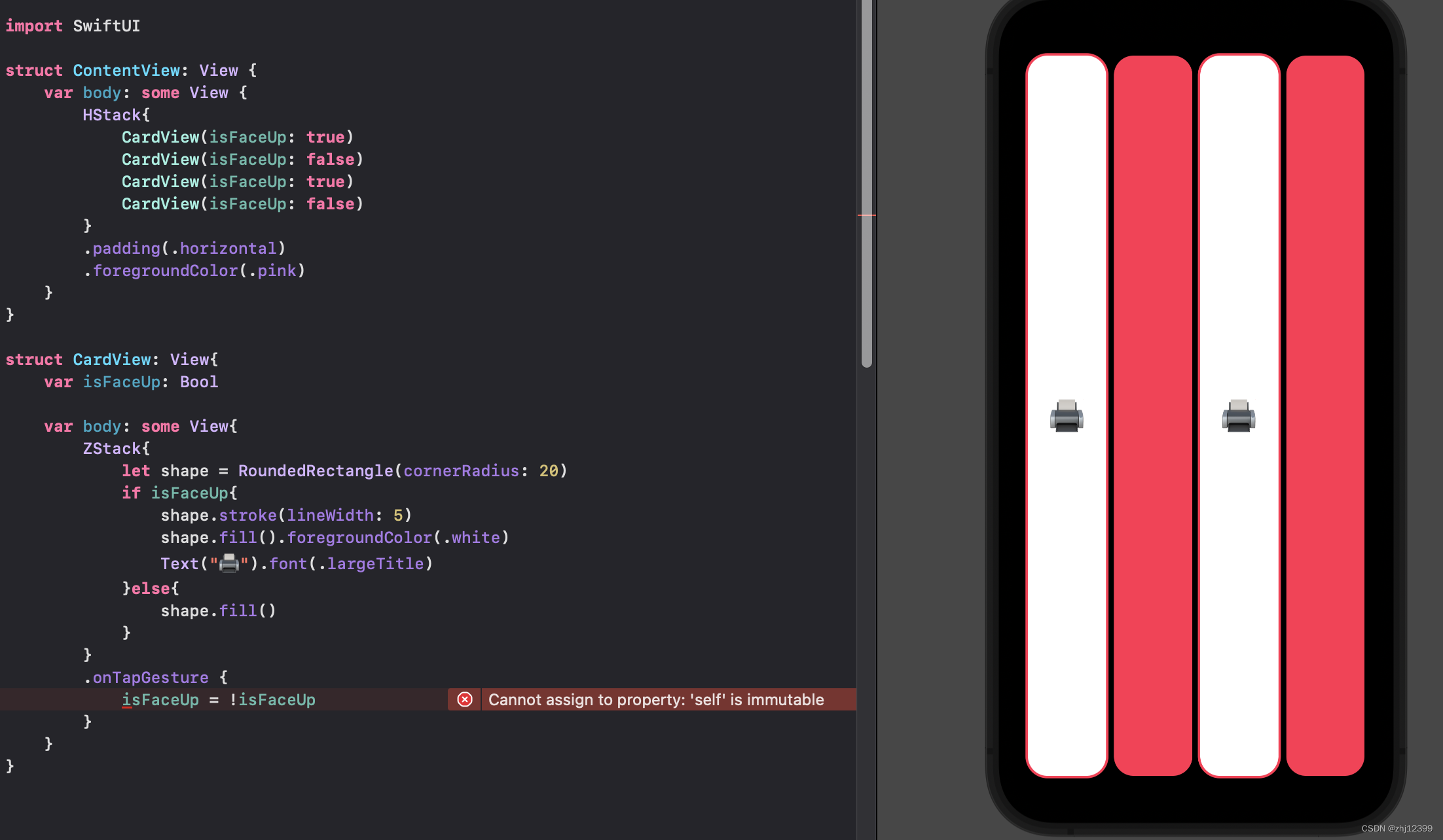
View这个struct在创建后不能够被修改、但是我们可以使用@State的方法,让后面的变量指向内存中一个变量,然后后面我们可以修改这个内存信息,达到修改struct的效果。
这种方法不常用
swift">struct CardView: View{
    @State var isFaceUp: Bool

    var body: some View{
        ZStack{
            let shape = RoundedRectangle(cornerRadius: 20)
            if isFaceUp{
                shape.stroke(lineWidth: 5)
                shape.fill().foregroundColor(.white)
                Text("🖨️").font(.largeTitle)
            }else{
                shape.fill()
            }
        }
        .onTapGesture {
            isFaceUp = !isFaceUp
        }
    }
}
点击效果
swift">struct CardView: View{
    @State var isFaceUp: Bool

    var body: some View{
        ZStack{
            let shape = RoundedRectangle(cornerRadius: 20)
            if isFaceUp{
                shape.stroke(lineWidth: 5)
                shape.fill().foregroundColor(.white)
                Text("🖨️").font(.largeTitle)
            }else{
                shape.fill()
            }
        }
        .onTapGesture {
            isFaceUp = !isFaceUp
        }
    }
}
Array
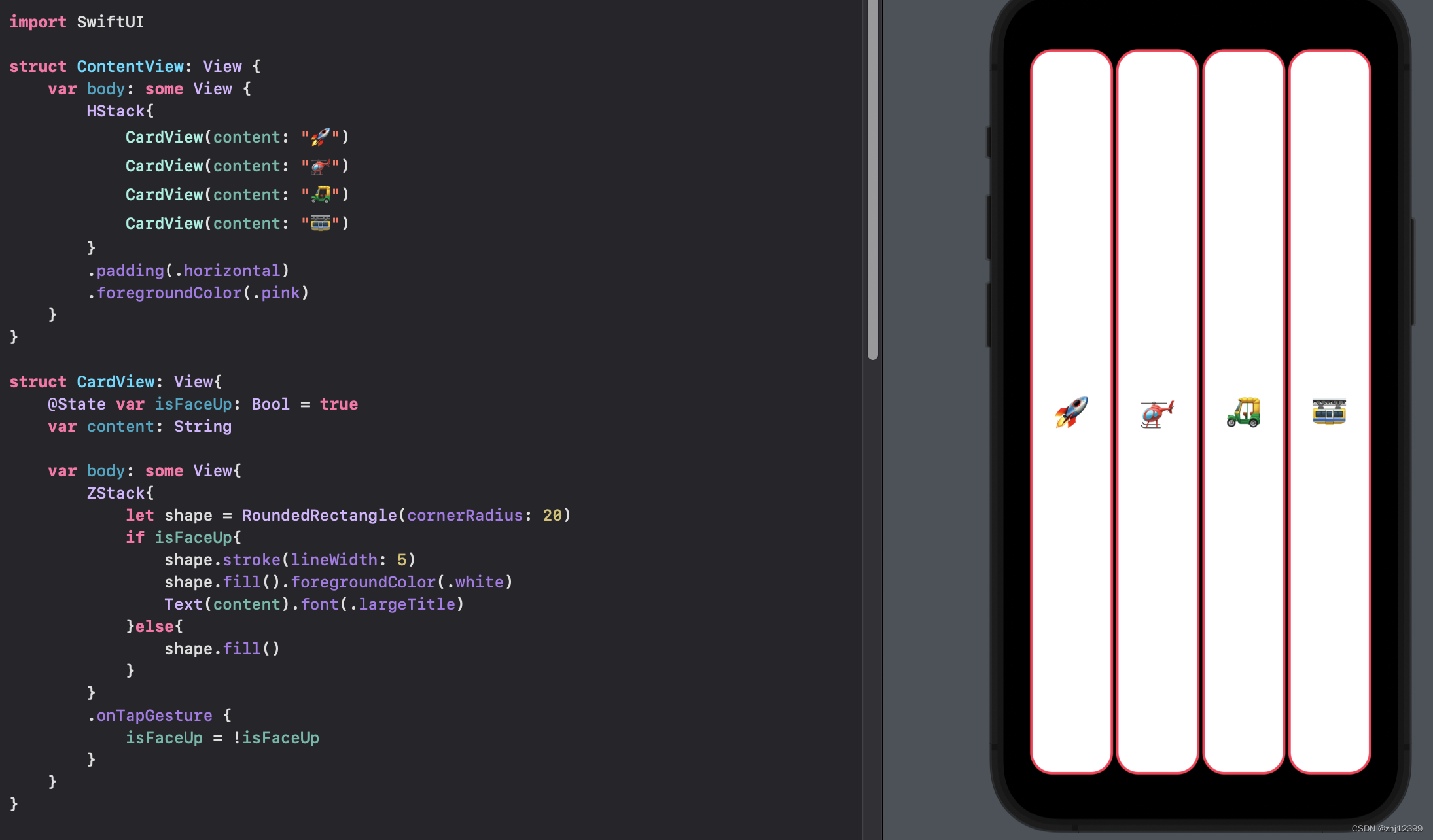
swift">var emojis: Array<String> = ["🚀", "🚁", "🛺", "🚟"]
//由Swift自动识别类型
var emojis = ["🚀", "🚁", "🛺", "🚟"]
按option点击array提示识别的类型
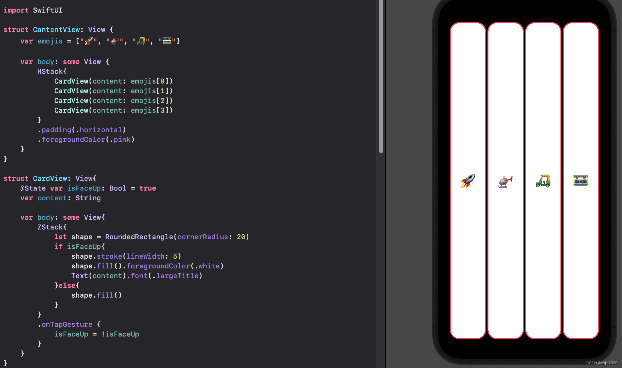
swift">struct ContentView: View {
    var emojis = ["🚀", "🚁", "🛺", "🚟"]

    var body: some View {
        HStack{
            CardView(content: emojis[0])
            CardView(content: emojis[1])
            CardView(content: emojis[2])
            CardView(content: emojis[3])
        }
        .padding(.horizontal)
        .foregroundColor(.pink)
    }
}
Foreach
这样写会使得相同的元素在点击时一起改变,这个问题先不考虑
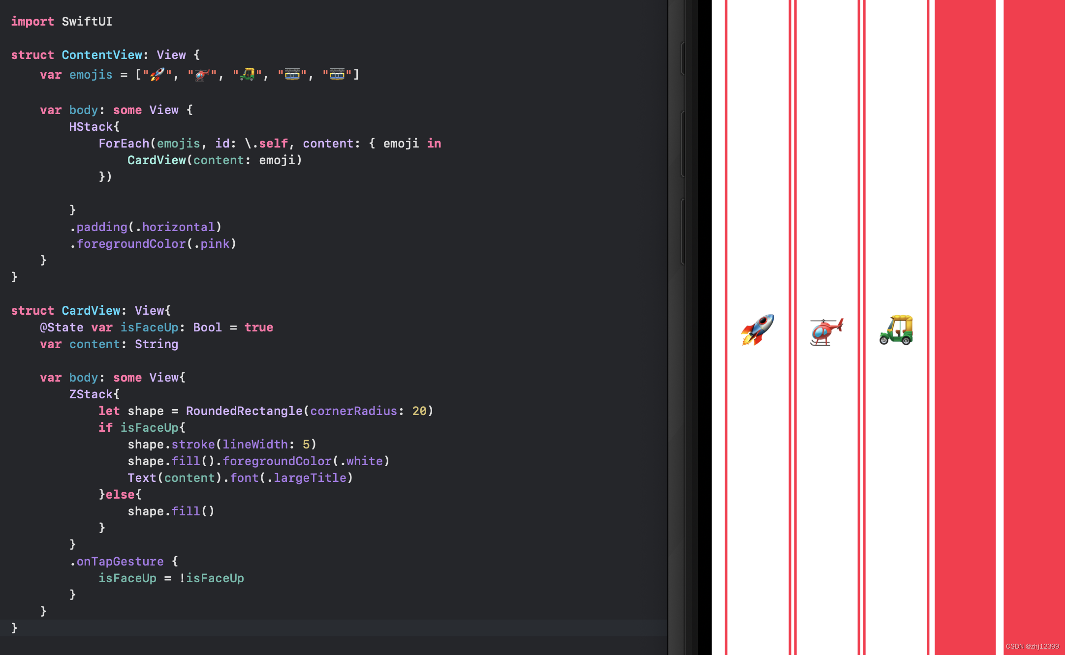
swift">struct ContentView: View {
    var emojis = ["🚀", "🚁", "🛺", "🚟", "🚟"]

    var body: some View {
        HStack{
            ForEach(emojis, id: \.self, content: { emoji in
                CardView(content: emoji)
            })

        }
        .padding(.horizontal)
        .foregroundColor(.pink)
    }
}
content作为最后一个元素,同时是个函数,我们可以省略一部分内容
swift">struct ContentView: View {
    var emojis = ["🚀", "🚁", "🛺", "🚟", "🚟"]

    var body: some View {
        HStack{
            ForEach(emojis, id: \.self) { emoji in
                CardView(content: emoji)
            }
        }
        .padding(.horizontal)
        .foregroundColor(.pink)
    }
}
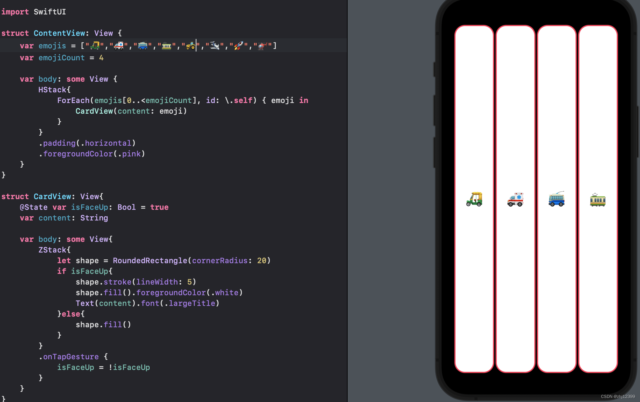
数组复选
swift">emojis[0...6] //包括6,既0-6,共7个
emojis[0..<6] //不包括6,既0-5,共6个
将最大值设置为变量
Button
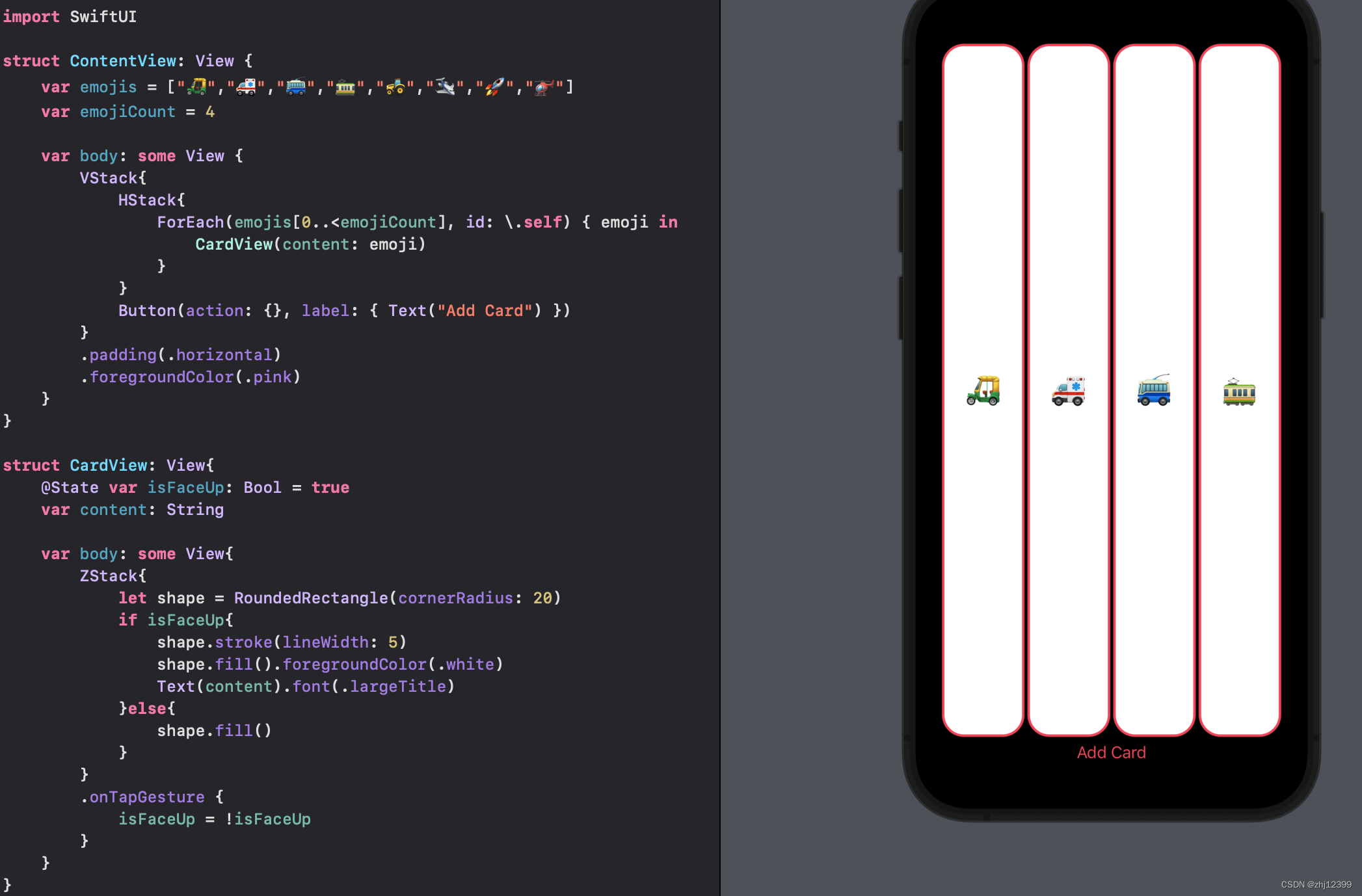
纵向排版
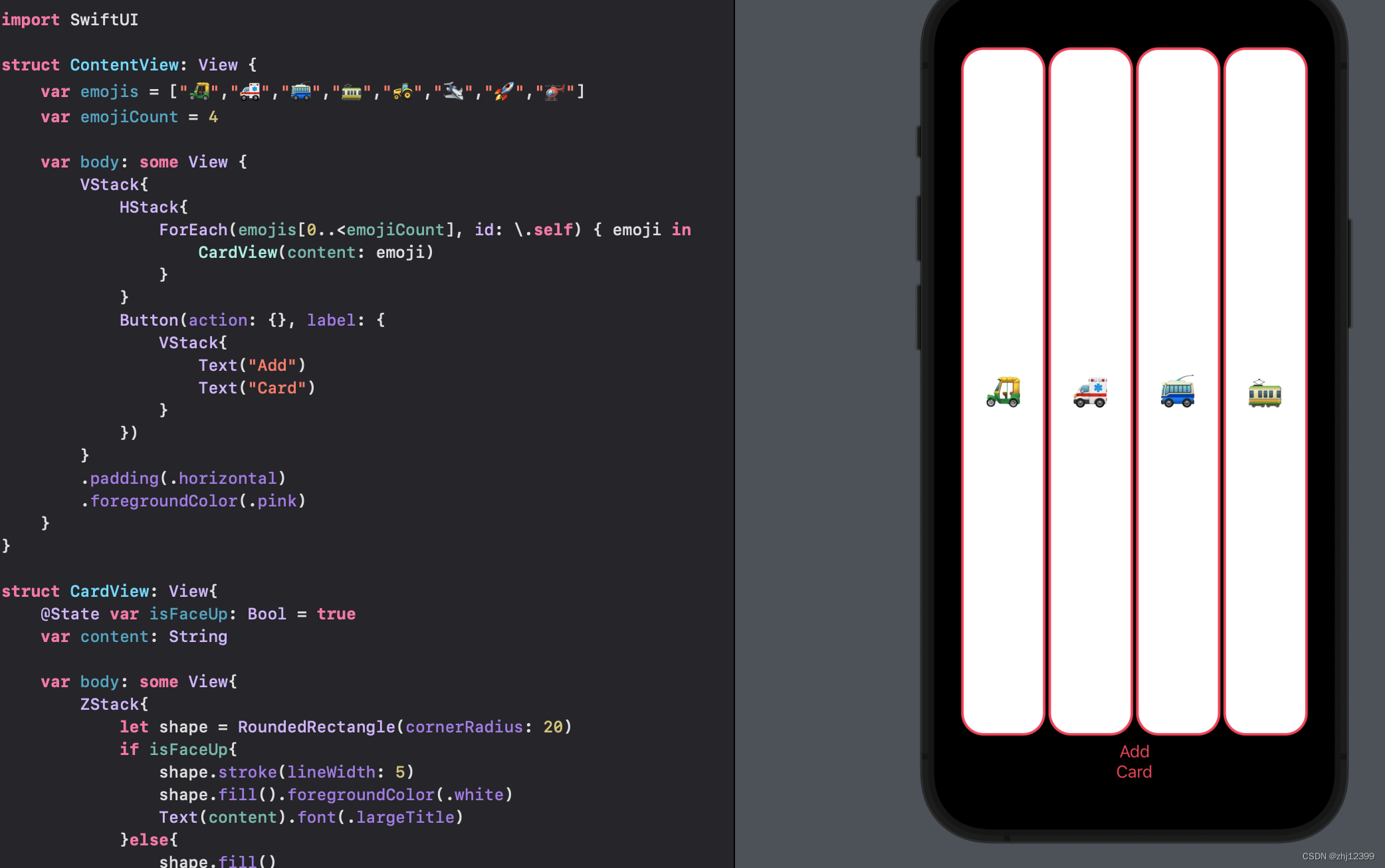
label里可以是任意的View
Spacer
尽可能多的填充空间
var整合小组件
SF-symbol
下载SF-symbol来查找symbol
Apple官网SF-symbol下载地址
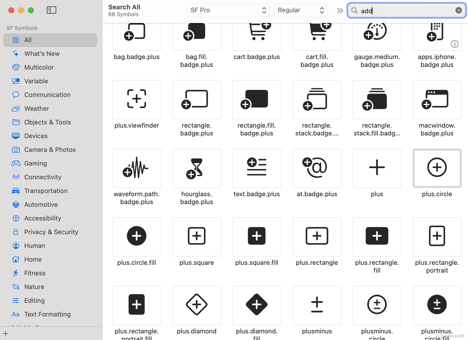
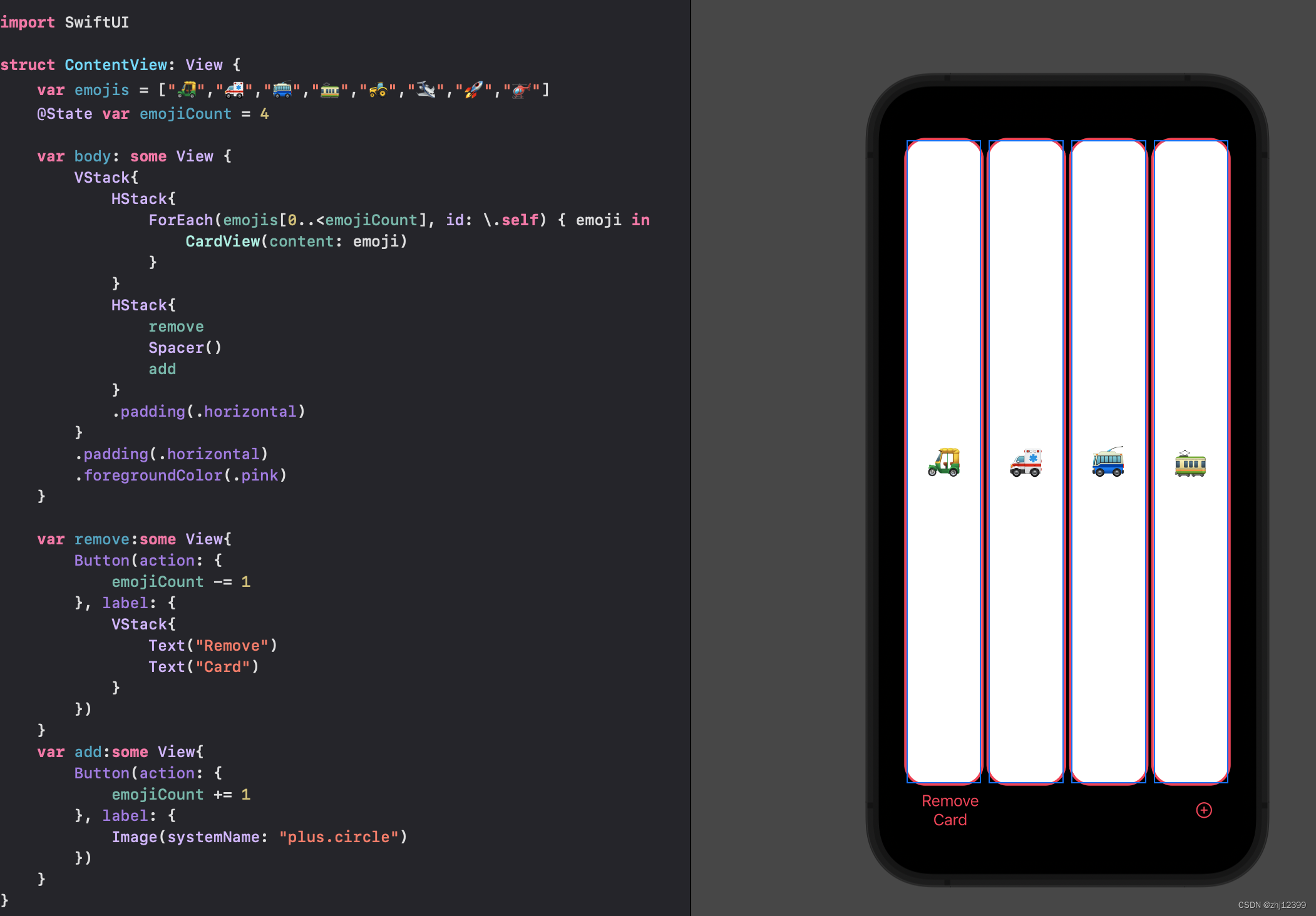
调用时使用
swift">Image(systemName: "plus.circle")
给整个HStack使用,改变内部所有字体
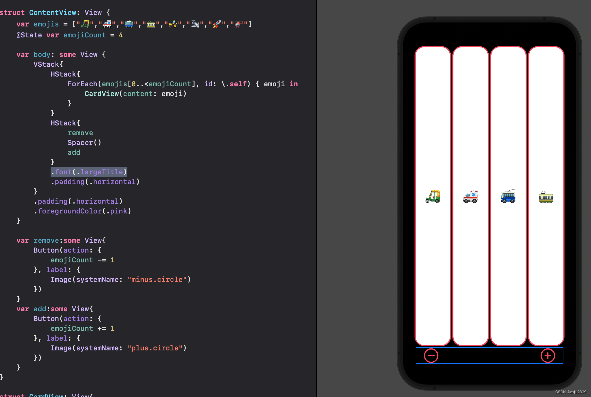
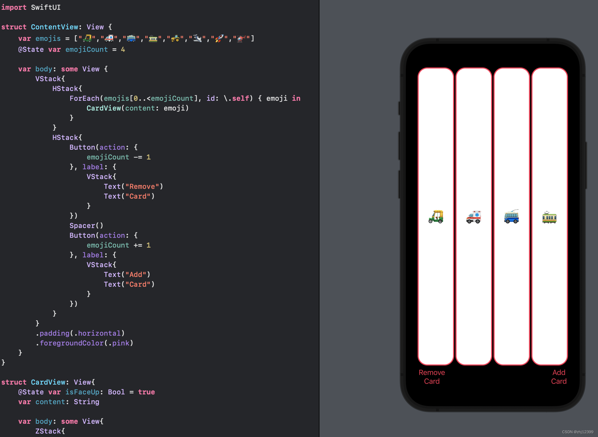
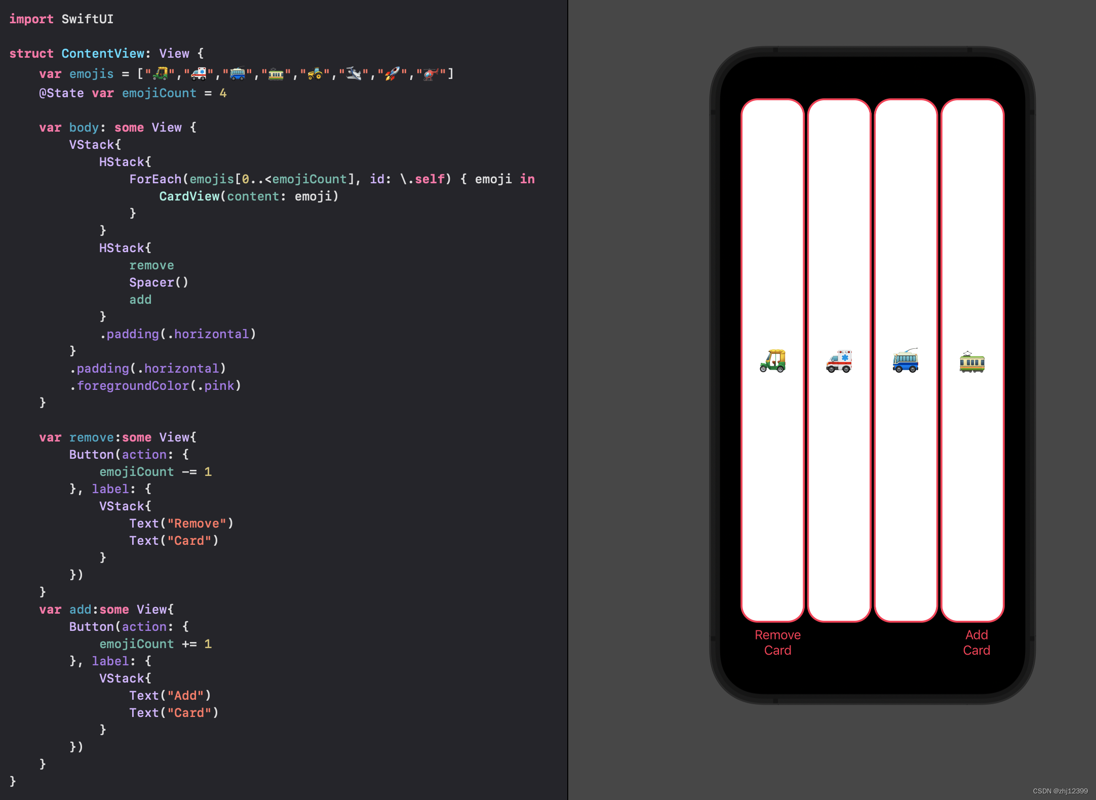
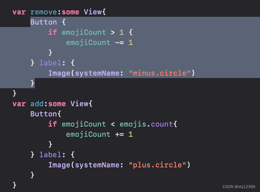
上下界限制
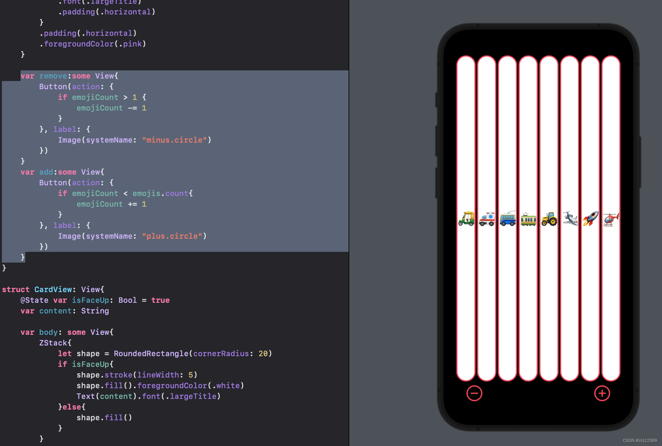
简化Button
swift">    var remove:some View{
        Button {
            if emojiCount > 1 {
                emojiCount -= 1
            }
        } label: {
            Image(systemName: "minus.circle")
        }
    }
    var add:some View{
        Button{
            if emojiCount < emojis.count{
                emojiCount += 1
            }
        } label: {
            Image(systemName: "plus.circle")
        }
    }
调整布局颜色
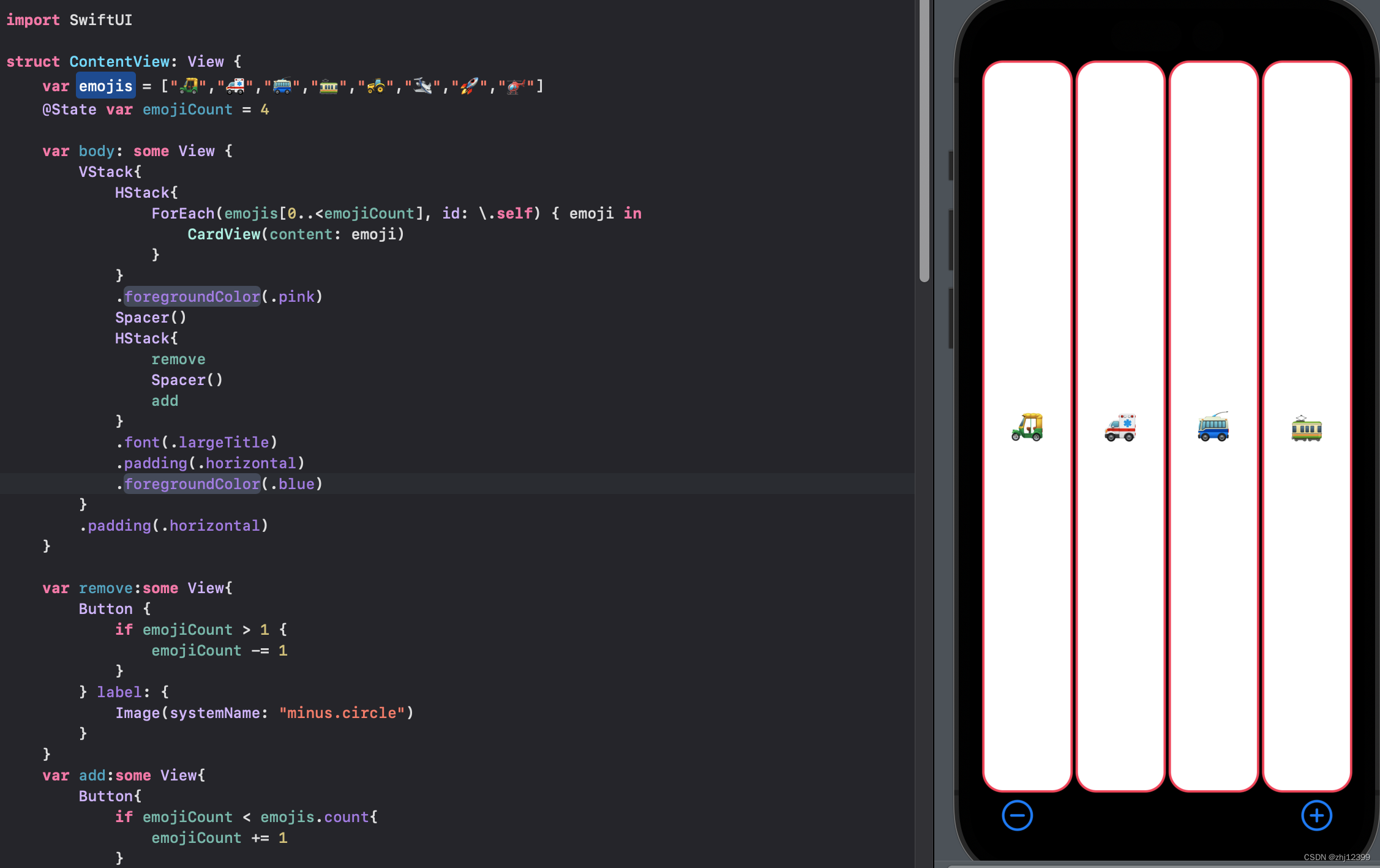
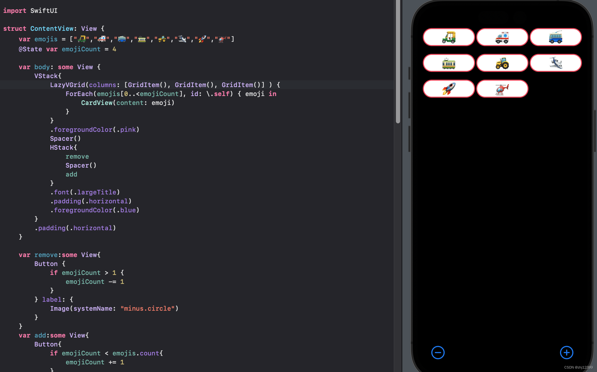
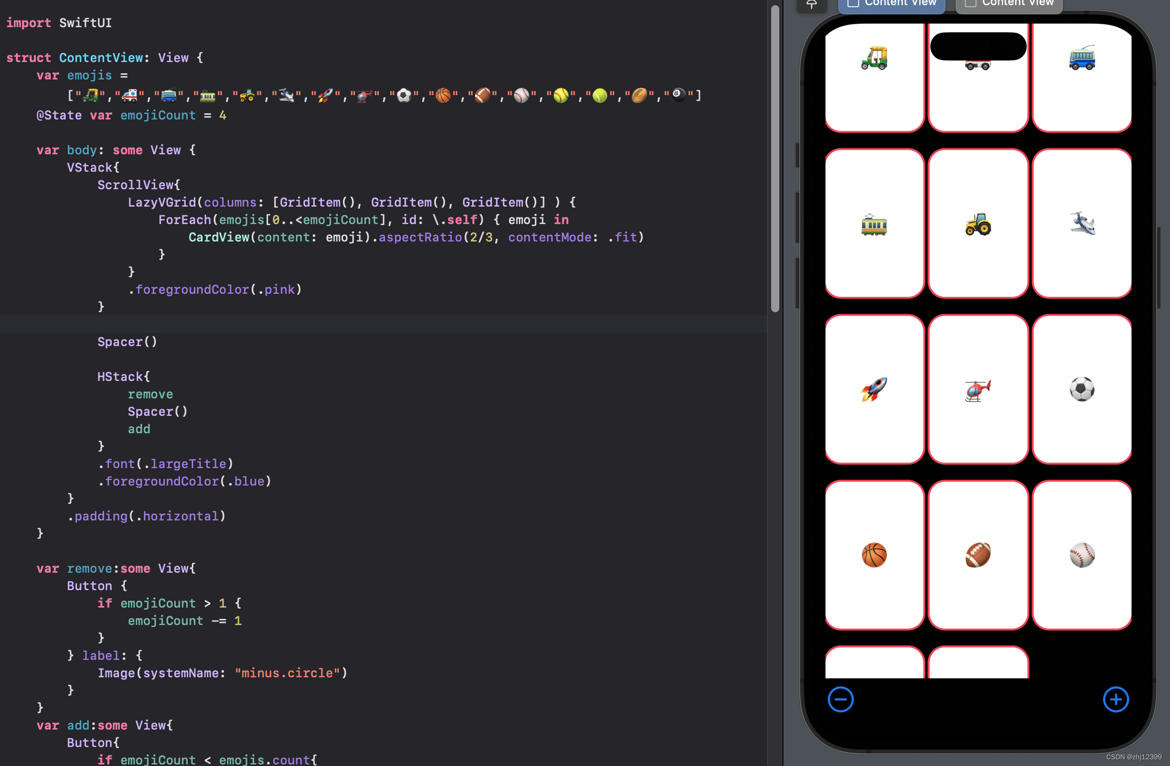
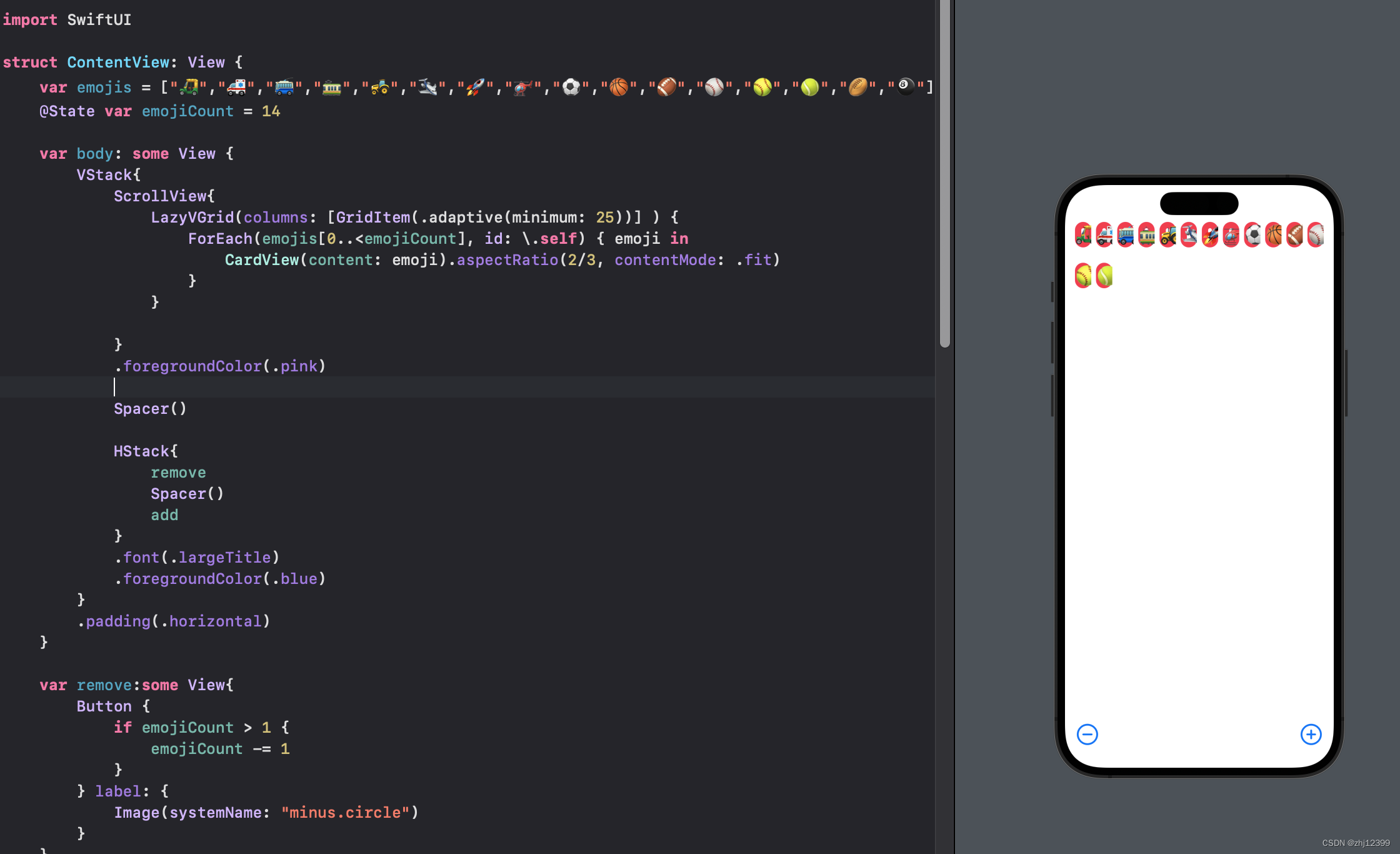
LazyVGrid
创建三列
swift">LazyVGrid(columns: [GridItem(), GridItem(), GridItem()] ) {
    ForEach(emojis[0..<emojiCount], id: \.self) { emoji in
        CardView(content: emoji)
    }
}
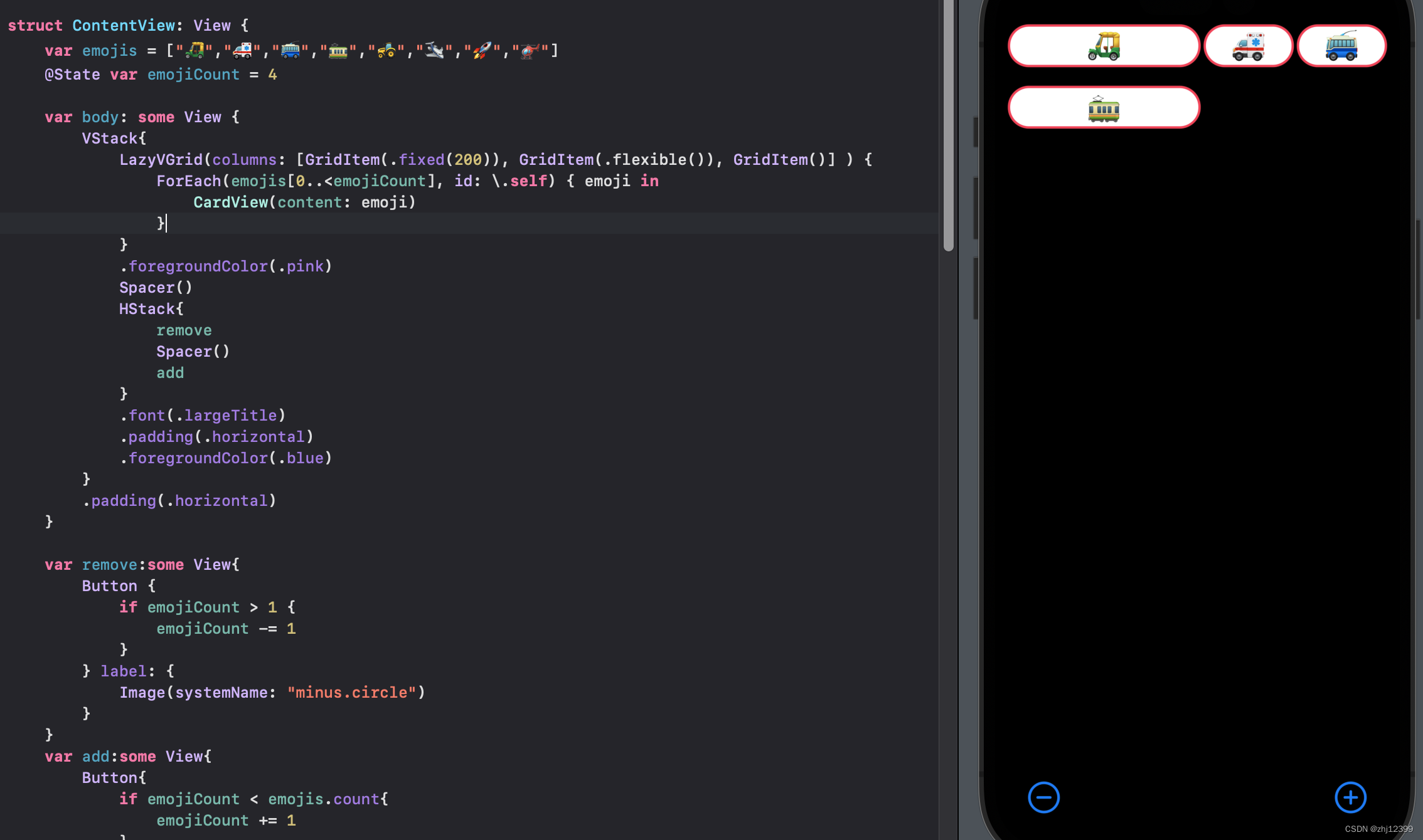
调整列宽度
swift">LazyVGrid(columns: [GridItem(.fixed(200)), GridItem(.flexible()), GridItem()] ) {
    ForEach(emojis[0..<emojiCount], id: \.self) { emoji in
        CardView(content: emoji)
    }
}
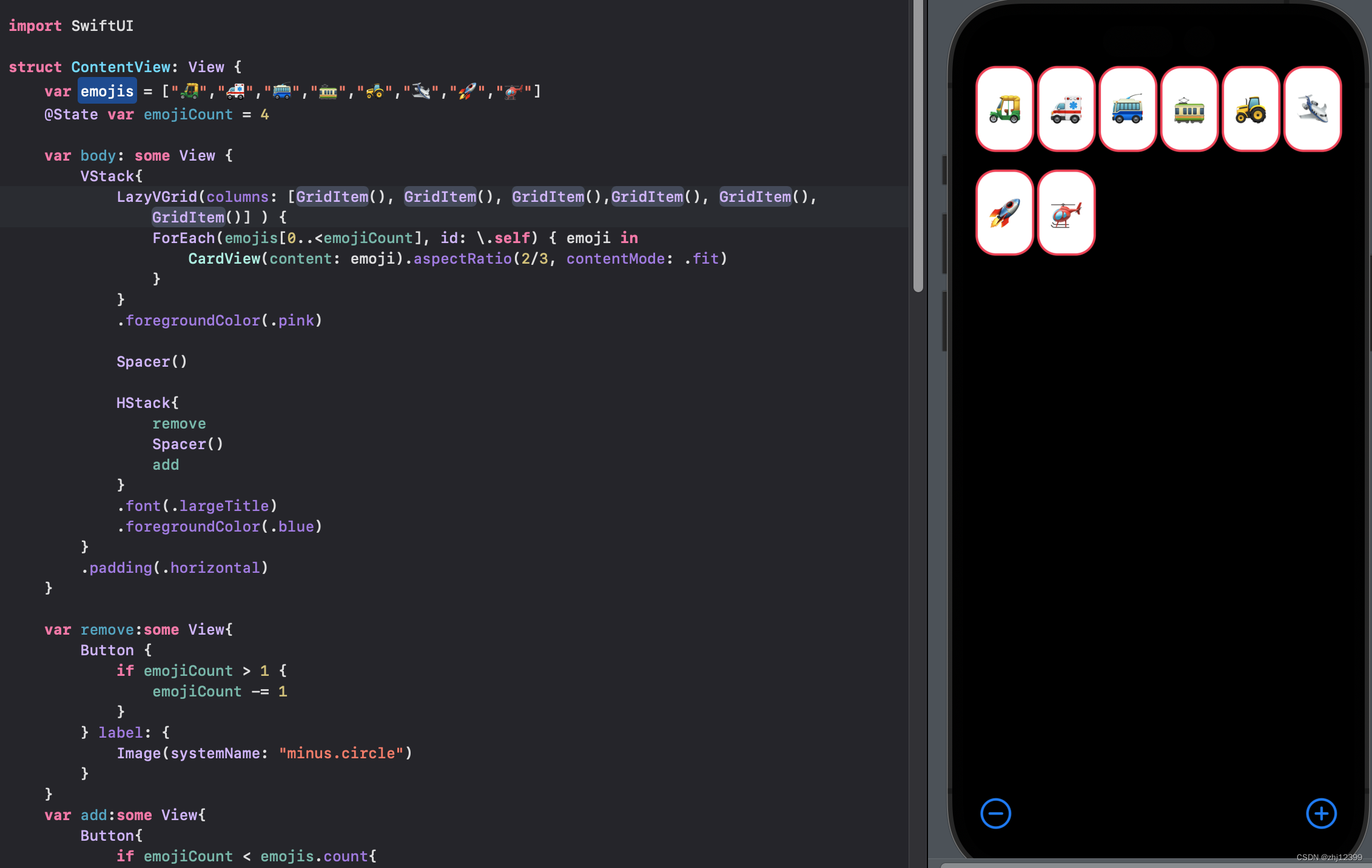
调整卡片比例
swift">LazyVGrid(columns: [GridItem(), GridItem(), GridItem()] ) {
    ForEach(emojis[0..<emojiCount], id: \.self) { emoji in
        CardView(content: emoji).aspectRatio(2/3, contentMode: .fit)
    }
}
此时会将加减号推出屏幕
ScrollView
ScrollView{
    LazyVGrid(columns: [GridItem(), GridItem(), GridItem()] ) {
        ForEach(emojis[0..<emojiCount], id: \.self) { emoji in
            CardView(content: emoji).aspectRatio(2/3, contentMode: .fit)
        }
    }
    .foregroundColor(.pink)
}
strokeBorder
这里可以看到卡片的边缘被裁减了一些
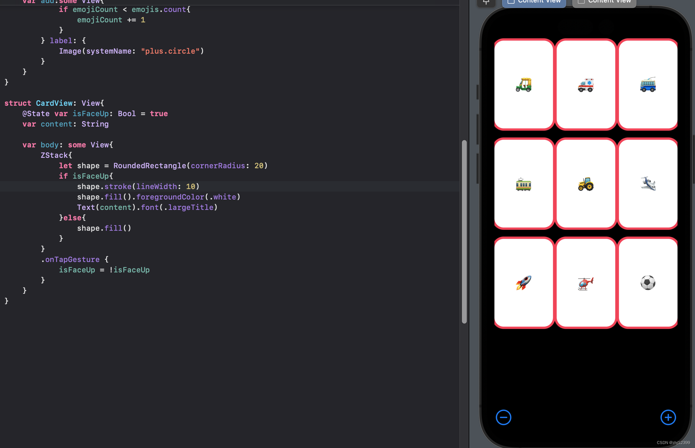
修改为strokeWidth
swift">//只有内边框
shape.strokeBorder(lineWidth:10)
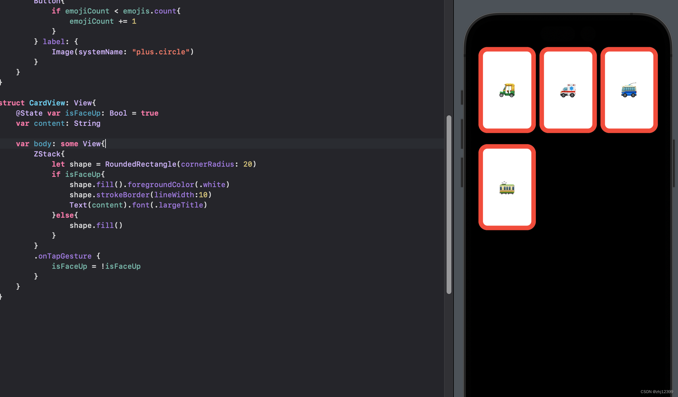
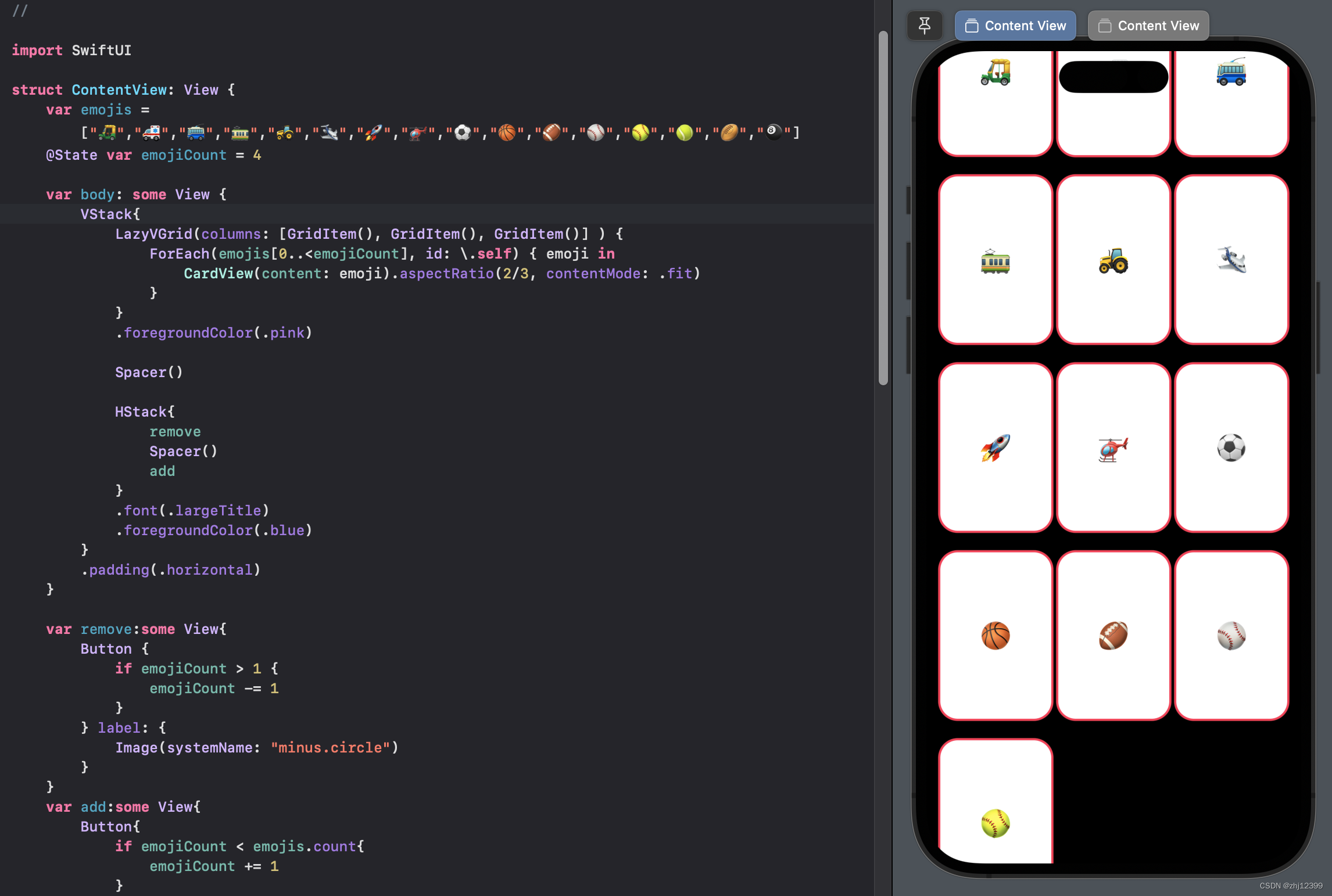
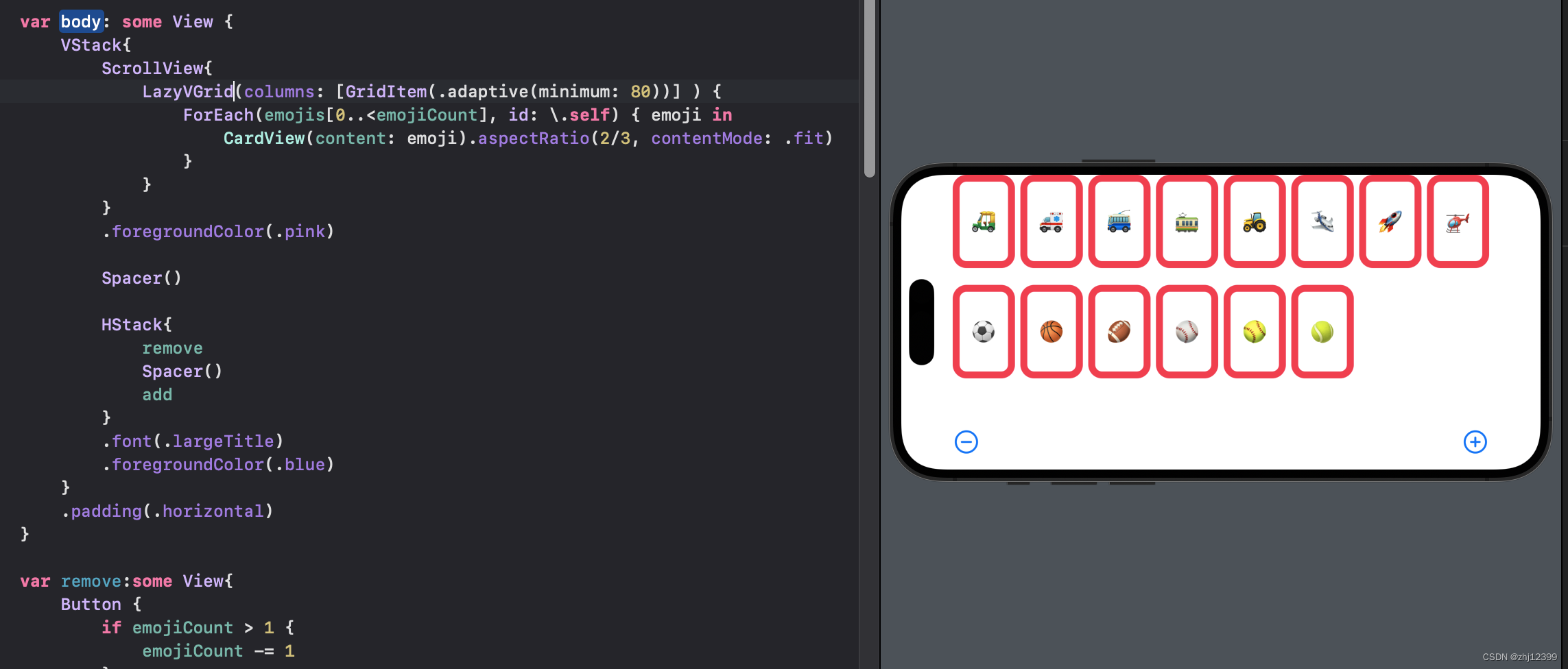
横向设计
swift">LazyVGrid(columns: [GridItem(.adaptive(minimum: 80))] ) {
    ForEach(emojis[0..<emojiCount], id: \.self) { emoji in
        CardView(content: emoji).aspectRatio(2/3, contentMode: .fit)
    }
}
Lecture 2 Assignment I
Memorize
Required Tasks
1.Get the Memorize game working as demonstrated in lectures 1 and 2. Type in all the code. Do not copy/paste from anywhere.
2.You can remove the ⊖ and ⊕ buttons at the bottom of the screen.
3.Add a title “Memorize!” to the top of the screen.
4.Add at least 3 “theme choosing” buttons to your UI, each of which causes all of the cards to be replaced with new cards that contain emoji that match the chosen theme. You can use Vehicles from lecture as one of the 3 themes if you want to, but you are welcome to create 3 (or more) completely new themes.
5.The number of cards in each of your 3 themes should be different, but in no case fewer than 8.
6.The cards that appear when a theme button is touched should be in an unpredictable (i.e. random) order. In other words, the cards should be shuffled each time a theme button is chosen.
7.The theme-choosing buttons must include an image representing the theme and text describing the theme stacked on top of each other vertically.
8.The image portion of each of the theme-choosing buttons must be created using an SF Symbol which evokes the idea of the theme it chooses (like the car symbol and the Vehicles theme shown in the Screenshot section below).
9.The text description of the theme-choosing buttons must use a noticeably smaller font than the font we chose for the emoji on the cards.
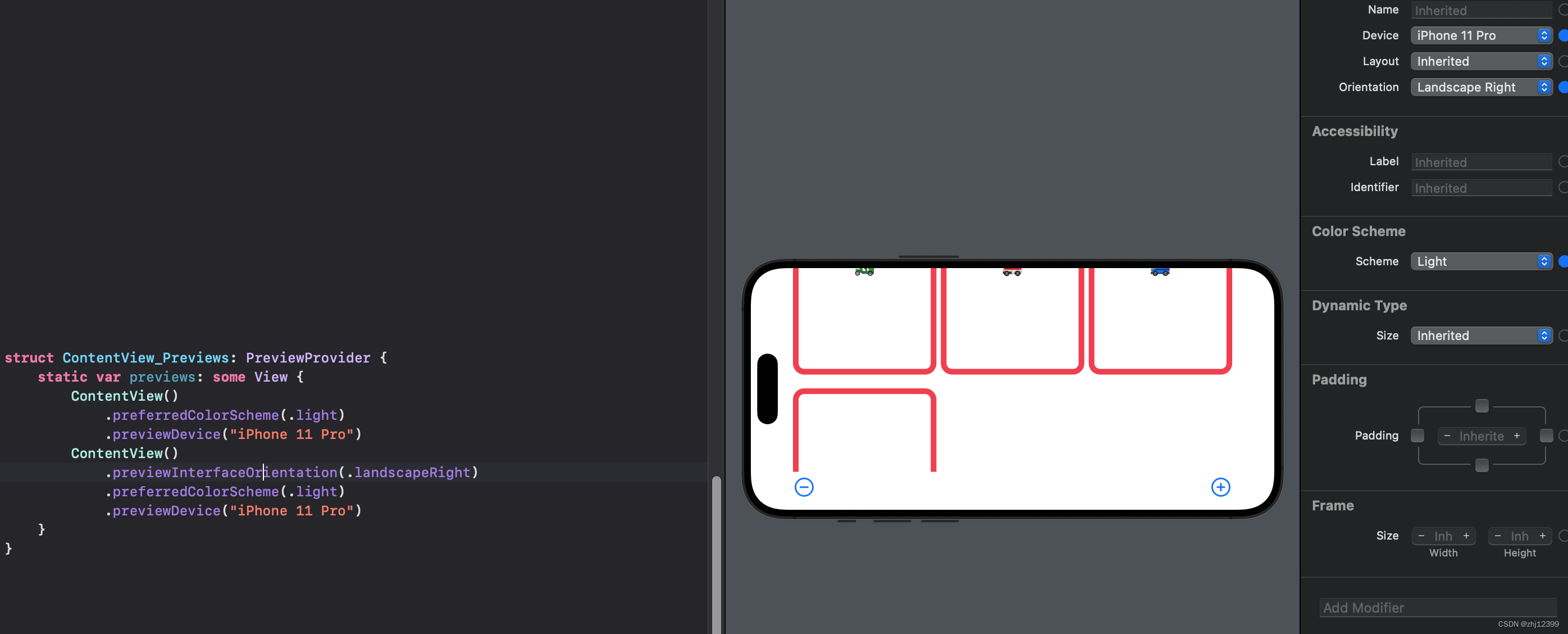
10.Your UI should work in portrait or landscape on any iPhone. This probably will not require any work on your part (that’s part of the power of SwiftUI), but be sure to experiment with running on different simulators in Xcode to be sure.
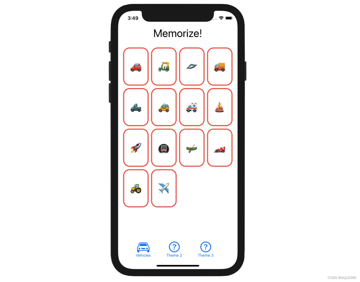
Screenshot
Screenshots are only provided in this course to help if you are having trouble visualizing what the Required Tasks are asking you to do. Screenshots are not part of the Required Tasks themselves (i.e. your UI does not have to look exactly like what you see below).
Hints
1.Economy is valuable in coding. The easiest way to ensure a bug-free line of code is not to write that line of code at all.
2.You will almost certainly want to make the emojis var in your ContentView be @State (since you’re going to be changing the contents of this Array as you choose different themes and shuffle cards).
3.You might have to pick your themes based on what symbols you’re able to find in SF Symbols! There is a much wider variety of emoji to choose from in the universe than there are SF Symbols to choose from.
4.Shuffling the cards might be easier than you think. Be sure to familiarize yourself with the documentation for Array. Note that there are some seemingly identical functions in Array, one of which is a verb and other is an adjective that is the past- tense of that verb. Try to figure out the difference (though you can use either one). In Swift, we generally prefer using the “past tense verb form” version. You’ll find out why next week.
5.Other than reviewing the documentation for Array, you are not expected to use any aspect of Swift/SwiftUI that was not shown in lecture (though you are welcome to try to if you want!). You’ll be doing exactly the same sorts of things we did in lecture.
6.Required Task 6 only says the cards need to appear in random order when a theme button is pressed. It is perfectly fine if your application launches with exactly the same theme and cards in exactly the same order each time. We haven’t learned yet how to set up the way a View looks when it first appears, so you can hardwire that as needed for this assignment.
7.You can control the size of your SF Symbol images using .font(). SF Symbols are often interleaved with surrounding Text and so Image(systemName:) conveniently adjusts the size of the Image depending on the .font() it is modified with. It’s probably a good idea to use .largeTitle for these (but not for the text captions underneath them since Required Task 9 prohibits that).
8.Don’t forget that you can add View modifiers (like .font(), for example) either in the Inspector on the right-hand side of Xcode’s screen or by directly typing in the code to call the function.
9.Give some thought to how your theme-choosing buttons and their associated text are aligned relative to each other, especially if the SF Symbols you choose are of varying heights, for example. This is not a Required Task, but a good solution will consider this. In lecture, we did briefly see how to align things that are stacked together.
10.We’re not looking for super-clean Swift code in this assignment (because you barely know anything about the language!). So, for example, if you end up having numerous array literals like ["🚗 ","🚕 ","🚙 ",“🚌 ”] peppered about your code (even if you end up duplicating the same one in two different places), that’s okay. We’ll learn how to handle constants like this next week.
11.A great way to help verify Required Task 10 is to add more iPhone devices to your Preview pane (just like we did for dark mode in the demo). Give it a try!
12.If you really want to test yourself this week, check out the “Extra Credit” below!
Things to Learn
Here is a partial list of concepts this assignment is intended to let you gain practice with or otherwise demonstrate your knowledge of.
1.Xcode 12
2.Swift 5.4
3.Writing code in the in-line function that supplies the value of a View’s body var
4.Syntax for passing closures (aka in-line functions) (i.e. code in { }) as arguments
5.Understanding the syntax of a ViewBuilder (e.g. “bag of Lego”) function
6.Using basic building block Views like Text, Button, Spacer, etc.
7.Putting Views together using VStack, HStack, etc.
8.Modifying Views (using .font(), etc.)
9.Using @State (we’ll learn much more about this construct later, by the way)
10.Very simple use of Array
11.Using a Range (e.g. 0…<emojiCount) as a subscript to an Array
12.The SF Symbols application
13.Putting system images into your UI using Image(systemName:)
14.Looking things up in the documentation (Array and possibly Font)
15.Int.random(in:) (Extra Credit)
16.Running your application in different simulators
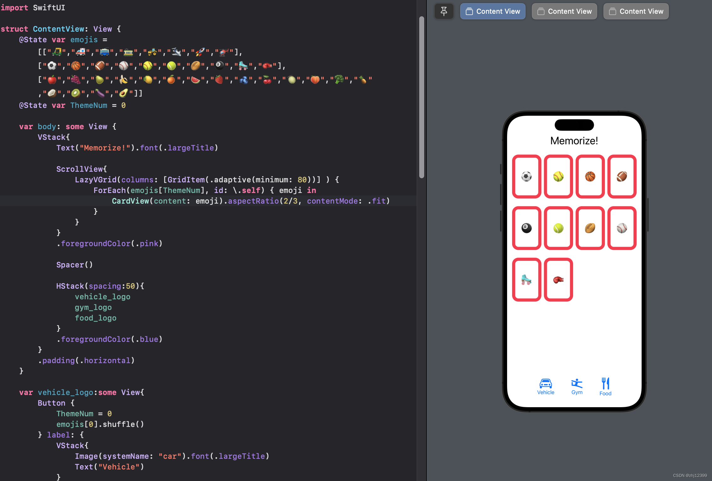
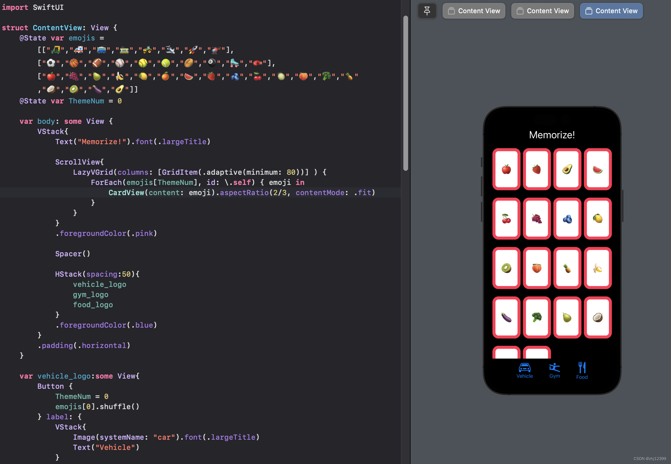
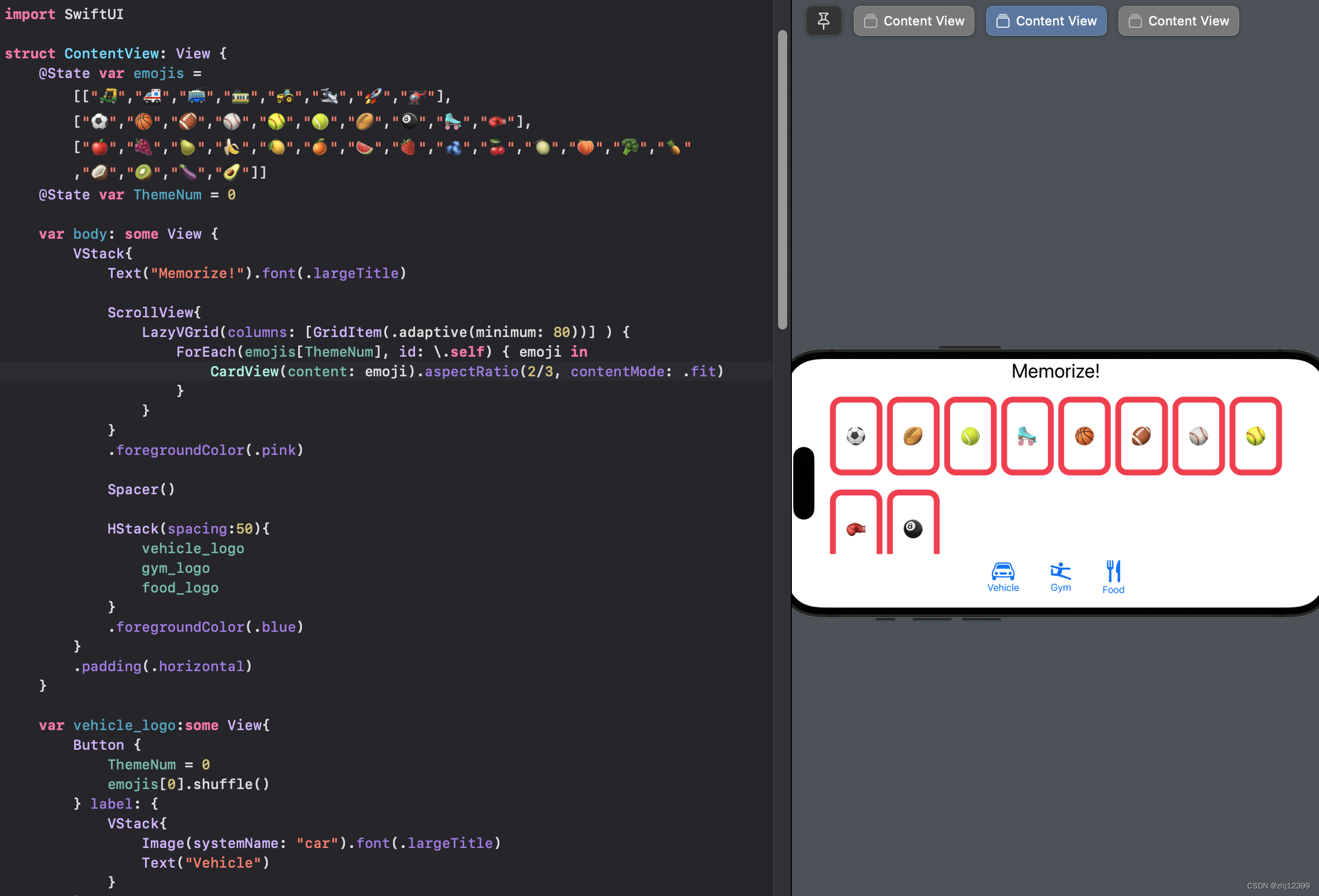
My Code
swift">//
// ContentView.swift
// Memorize
//
// Created by zhj12399 on 2023/1/3.
//
import SwiftUI
struct ContentView: View {
@State var emojis = [["🛺","🚑","🚎","🚃","🚜","🛩️","🚀","🚁"],["⚽️","🏀","🏈","⚾️","🥎","🎾","🏉","🎱","🛼","🥊"],["🍎","🍇","🍐","🍌","🍋","🍊","🍉","🍓","🫐","🍒","🍈","🍑","🥦","🍍","🥥","🥝","🍆","🥑"]]
@State var ThemeNum = 0
var body: some View {
VStack{
Text("Memorize!").font(.largeTitle)
ScrollView{
LazyVGrid(columns: [GridItem(.adaptive(minimum: 80))] ) {
ForEach(emojis[ThemeNum], id: \.self) { emoji in
CardView(content: emoji).aspectRatio(2/3, contentMode: .fit)
}
}
}
.foregroundColor(.pink)
Spacer()
HStack(spacing:50){
vehicle_logo
gym_logo
food_logo
}
.foregroundColor(.blue)
}
.padding(.horizontal)
}
var vehicle_logo:some View{
Button {
ThemeNum = 0
emojis[0].shuffle()
} label: {
VStack{
Image(systemName: "car").font(.largeTitle)
Text("Vehicle")
}
}
}
var gym_logo:some View{
Button{
ThemeNum = 1
emojis[1].shuffle()
} label: {
VStack{
Image(systemName: "figure.gymnastics").font(.largeTitle)
Text("Gym")
}
}
}
var food_logo:some View{
Button{
ThemeNum = 2
emojis[2].shuffle()
}label: {
VStack{
Image(systemName: "fork.knife").font(.largeTitle)
Text("Food")
}
}
}
}
struct CardView: View{
@State var isFaceUp: Bool = true
var content: String
var body: some View{
ZStack{
let shape = RoundedRectangle(cornerRadius: 20)
if isFaceUp{
shape.fill().foregroundColor(.white)
shape.strokeBorder(lineWidth:10)
Text(content).font(.largeTitle)
}else{
shape.fill()
}
}
.onTapGesture {
isFaceUp = !isFaceUp
}
}
}
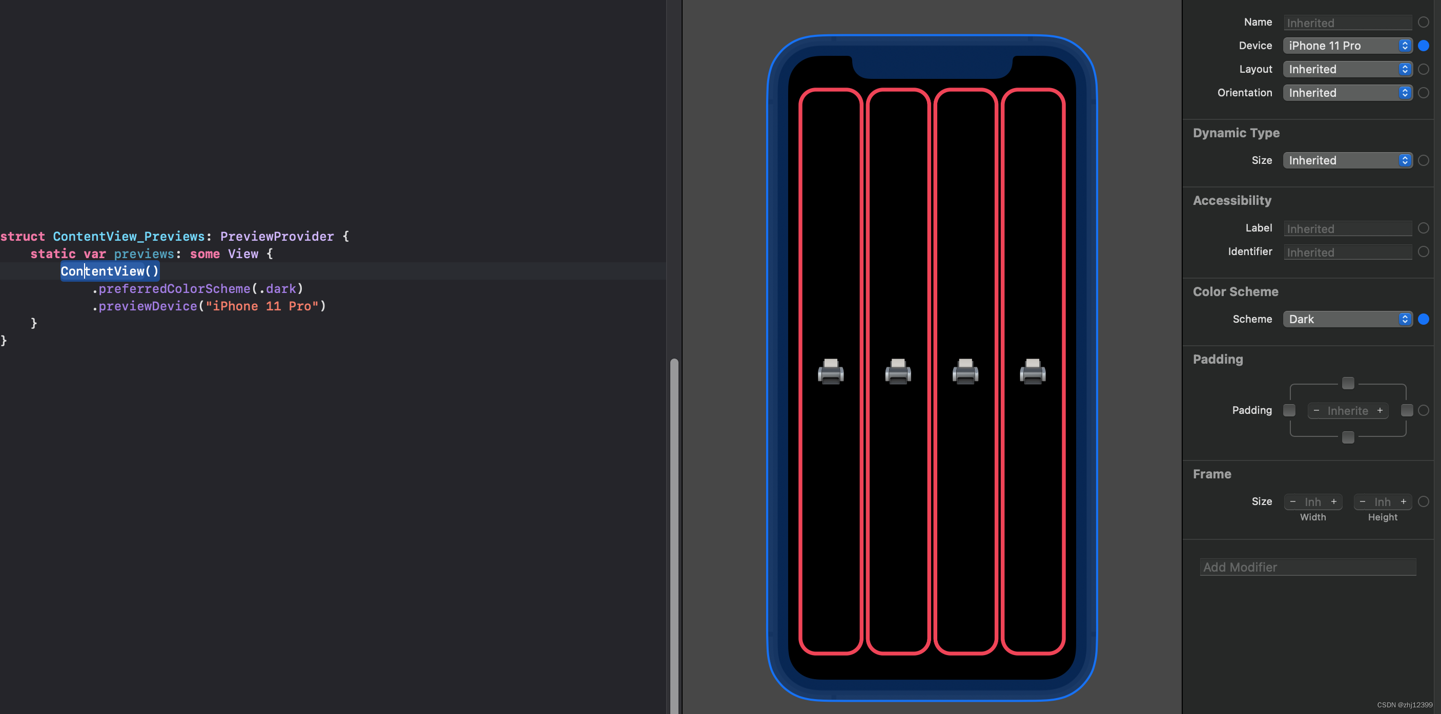
struct ContentView_Previews: PreviewProvider {
static var previews: some View {
ContentView()
.preferredColorScheme(.light)
.previewDevice("iPhone 11 Pro")
ContentView()
.previewInterfaceOrientation(.landscapeRight)
.preferredColorScheme(.light)
.previewDevice("iPhone 11 Pro")
ContentView()
.preferredColorScheme(.dark)
.previewDevice("iPhone 11 Pro")
}
}
Extra Credit
Here are some additional ways to challenge yourself …
1.Make a random number of cards appear each time a theme button is chosen. The function Int.random(in: Range) can generate a random integer in any range, for example, let random = Int.random(in: 15…75) would generate a random integer between 15 and 75 (inclusive). Always show at least 4 cards though.
2.Try to come up with some sort of equation that relates the number of cards in the game to the width you pass when you create your LazyVGrid’s GridItem(.adaptive(minimum:maximum:)) such that each time a theme button is chosen, the LazyVGrid makes the cards as big as possible without having to scroll.
For example, if 8 cards are shown, the cards should be pretty big, but if 24 cards are shown, they should be smaller. The cards should still have our 2/3 aspect ratio.
It doesn’t have to be perfect either (i.e. if there are a few extreme combinations of device size (e.g. iPod touch for example) and number of cards, punting to scrolling is okay). The goal is to make it noticeably better than always using 65 is.
It’s probably impossible to pick a width that makes the cards fit just right in both Portrait and Landscape, so optimize for Portrait and just let your ScrollView kick in if the user switches to Landscape.
Your “equation” can include some if-else’s if you want (i.e. it doesn’t have to be a single purely mathematical expression) but you don’t want to be special-casing every single number from 4 to 24 cards or some such. Try to keep your “equation” code efficient (i.e. not a lot of lines of code, but still works pretty well in the vast majority of situations).
The type of the arguments to GridItem(.adaptive(minimum:maximum:)) is a CGFloat. It’s just a normal floating point number that we use for drawing. You know what kind of results 65 gives you, so you’re going to have to experiment with other numbers up and down from there.
We haven’t covered functions yet, but you likely would want to put your calculation in a func. If so, you’d have to figure that out on your own. Your reading assignment covers func syntax in detail of course, but you probably just want something like this: func widthThatBestFits(cardCount: Int) -> CGFloat.
When you do this, it becomes even more obvious that we really want the font we use to draw the emoji to scale with the size of the cards. We’ll learn to do that next week or the week after, so there’s nothing to do on that front this week.
Finally, what you’ll really come to understand is that the “equation” we need is actually dependent on the size of the area we have to draw the cards in. That’s also something we’ll find out more about in lecture in the next week or so.
My Extra Credit Code
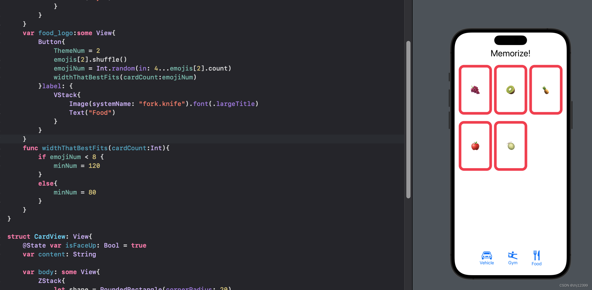
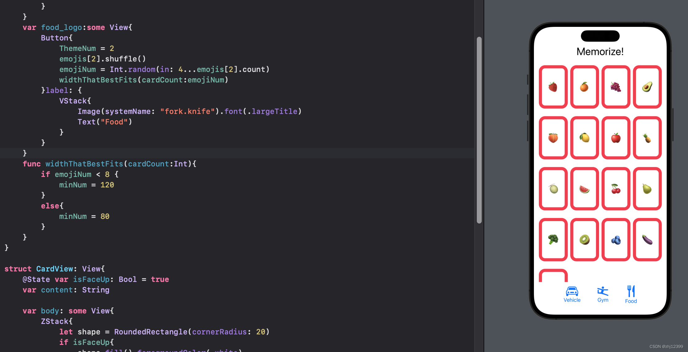
1.点击按钮改变数量
2.创建函数,根据数量大小更改card大小
swift">//
//  ContentView.swift
//  Memorize
//
//  Created by zhj12399 on 2023/1/3.
//
import SwiftUI

struct ContentView: View {
    @State var emojis = [["🛺","🚑","🚎","🚃","🚜","🛩️","🚀","🚁"],["⚽️","🏀","🏈","⚾️","🥎","🎾","🏉","🎱","🛼","🥊"],["🍎","🍇","🍐","🍌","🍋","🍊","🍉","🍓","🫐","🍒","🍈","🍑","🥦","🍍","🥥","🥝","🍆","🥑"]]
    @State var ThemeNum = 0
    @State var emojiNum = 8
    @State var minNum:CGFloat = 80

    var body: some View {
        VStack{
            Text("Memorize!").font(.largeTitle)

            ScrollView{
                LazyVGrid(columns: [GridItem(.adaptive(minimum: minNum))] ) {
                    ForEach(emojis[ThemeNum][0..<emojiNum], id: \.self) { emoji in
                        CardView(content: emoji).aspectRatio(2/3, contentMode: .fit)
                    }
                }
            }
            .foregroundColor(.pink)

            Spacer()

            HStack(spacing:50){
                vehicle_logo
                gym_logo
                food_logo
            }
            .foregroundColor(.blue)
        }
        .padding(.horizontal)
    }

    var vehicle_logo:some View{
        Button {
            ThemeNum = 0
            emojis[0].shuffle()
            emojiNum = Int.random(in: 4...emojis[0].count)
            widthThatBestFits(cardCount:emojiNum)
        } label: {
            VStack{
                Image(systemName: "car").font(.largeTitle)
                Text("Vehicle")
            }
        }
    }
    var gym_logo:some View{
        Button{
            ThemeNum = 1
            emojis[1].shuffle()
            emojiNum = Int.random(in: 4...emojis[1].count)
            widthThatBestFits(cardCount:emojiNum)
        } label: {
            VStack{
                Image(systemName: "figure.gymnastics").font(.largeTitle)
                Text("Gym")
            }
        }
    }
    var food_logo:some View{
        Button{
            ThemeNum = 2
            emojis[2].shuffle()
            emojiNum = Int.random(in: 4...emojis[2].count)
            widthThatBestFits(cardCount:emojiNum)
        }label: {
            VStack{
                Image(systemName: "fork.knife").font(.largeTitle)
                Text("Food")
            }
        }
    }
    func widthThatBestFits(cardCount:Int){
        if emojiNum < 8 {
            minNum = 120
        }
        else{
            minNum = 80
        }
    }
}

struct CardView: View{
    @State var isFaceUp: Bool = true
    var content: String

    var body: some View{
        ZStack{
            let shape = RoundedRectangle(cornerRadius: 20)
            if isFaceUp{
                shape.fill().foregroundColor(.white)
                shape.strokeBorder(lineWidth:10)
                Text(content).font(.largeTitle)
            }else{
                shape.fill()
            }
        }
        .onTapGesture {
            isFaceUp = !isFaceUp
        }
    }
}
struct ContentView_Previews: PreviewProvider {
    static var previews: some View {
        ContentView()
            .preferredColorScheme(.light)
            .previewDevice("iPhone 11 Pro")
        ContentView()
            .previewInterfaceOrientation(.landscapeRight)
            .preferredColorScheme(.light)
            .previewDevice("iPhone 11 Pro")
        ContentView()
            .preferredColorScheme(.dark)
            .previewDevice("iPhone 11 Pro")
    }
}
Lecture 1-2 课程资源
Lecture 1-2 Reading
Lecture 1-2 Assignment
Lecture 1-2 Homework